Creating a unified digital experience for Banesco Internacional by standardizing branding and websites across Venezuela, Panama, the Dominican Republic, and the United States, while allowing for content customization at each location.
Project summary
Banesco International is a financial institution operating across South America, Central America, North America, and Europe, with branches in Venezuela, the United States, the Dominican Republic, and Panama.
The project sought to establish a unified brand identity and website experience for these four branches. Each branch previously had a unique and distinct digital presence, with varying website structures, page layouts, and functionalities. By creating customizable templates, we aimed to provide a consistent and cohesive user experience across all branches.
OUR GOALS

Problem
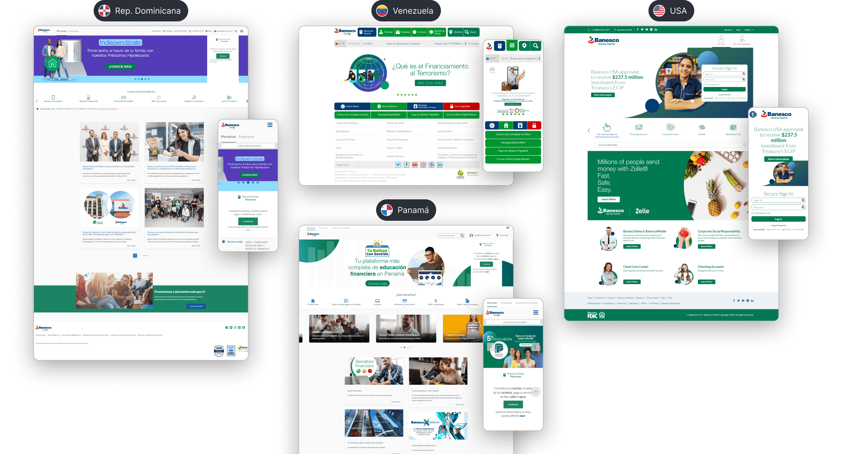
A significant issue across all websites was the lack of a comprehensive design system to ensure consistency among branches. While a brand manual existed, it primarily focused on logo and color usage.
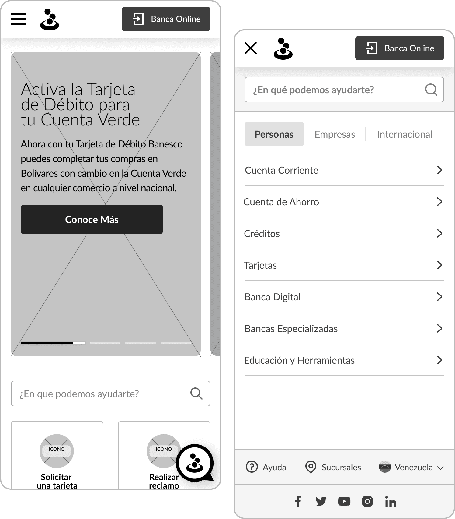
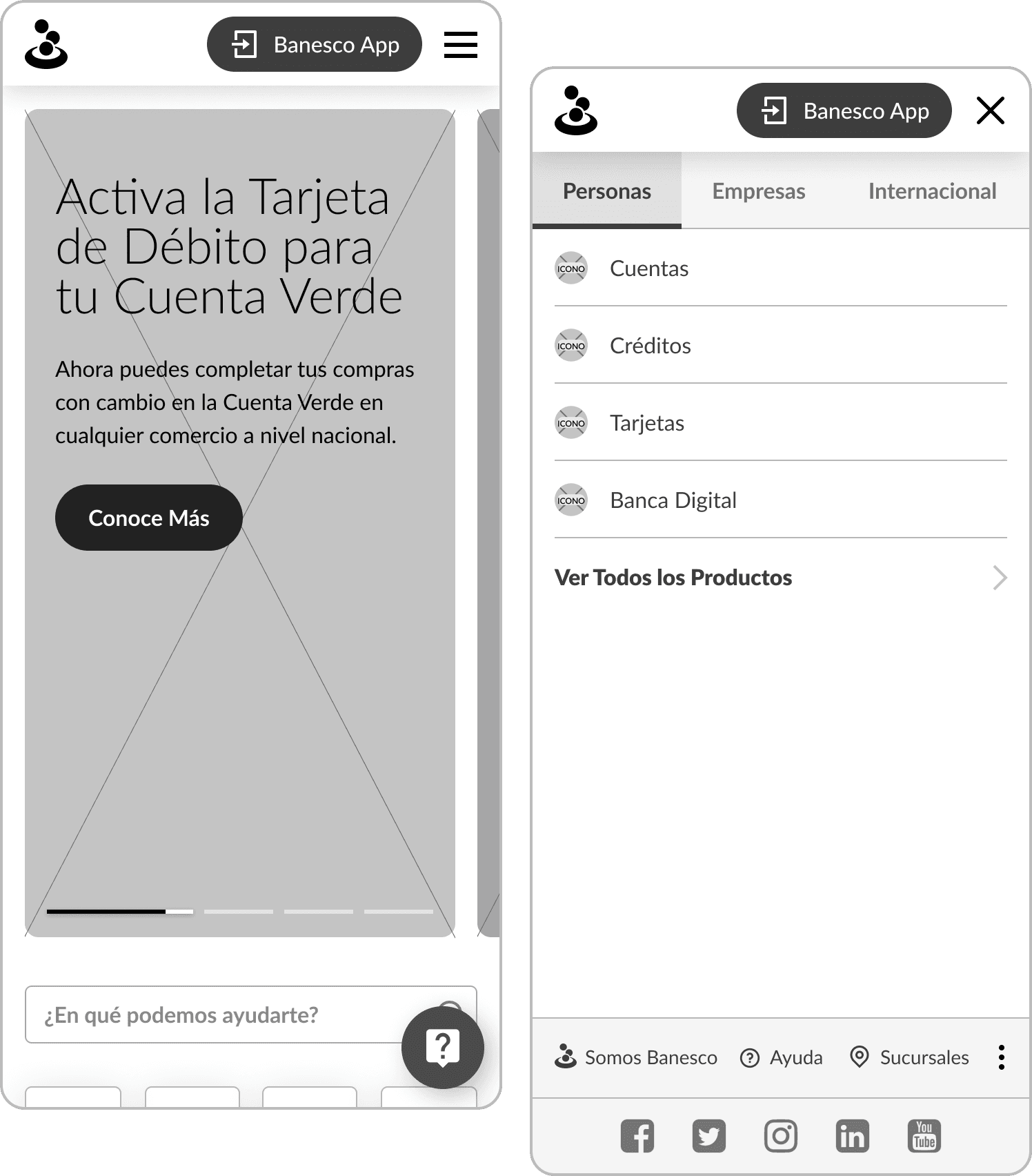
Consequently, there was a high degree of inconsistency in the design elements across different branches and even within individual websites. Elements such as buttons, text, and images were inconsistently sized and positioned. Furthermore, there was a lack of adherence to a grid system, and the brand colors were not always used correctly. Mobile versions also suffered from usability issues, with small text and buttons, and images that were often covered by text due to automatic resizing.

Inconsistent design resulting from the lack of a shared design system among all locations

Components and sections with no standardized structures and patterns

Lack of hierarchical organization of information

Poor mobile optimization
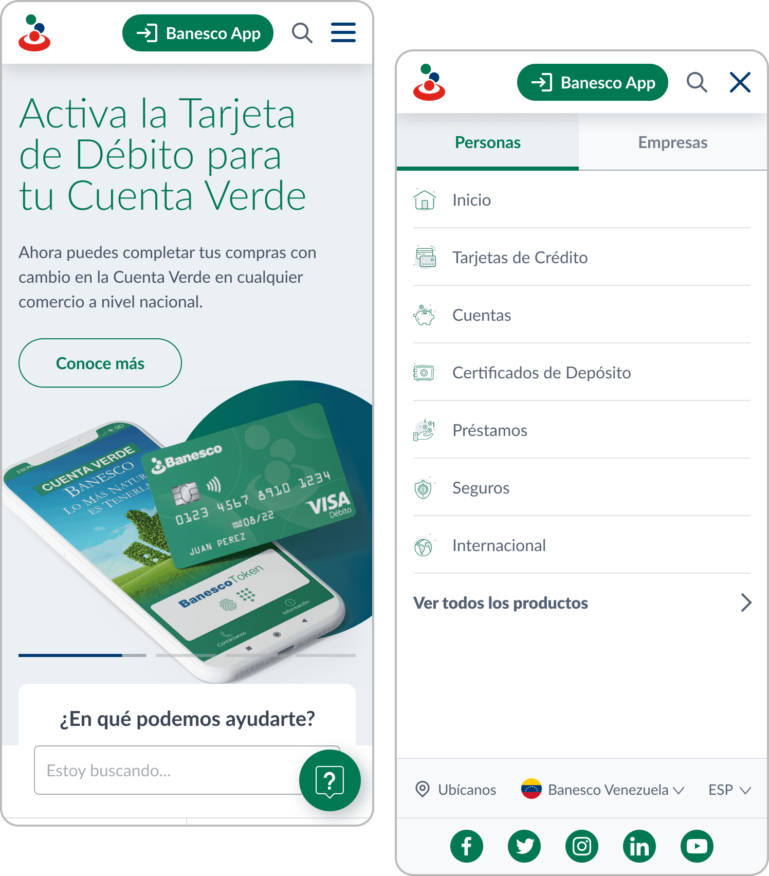
Previous websites of the four branches: Venezuela, Panama, Dominican Republic and the United States.
Design process
After a comprehensive audit of the four branches, we analyzed the websites of traditional banks like ABANCA and Santander, as well as digital banks such as Brubank and Revolut. The aim was to identify industry best practices and areas for improvement.
Next, we determined the common pages and subpages across all branches to create a flexible sitemap that could accommodate the needs of each location. We also identified shared content and sections to define the essential components and modules for each page. For instance, we discovered that card pages should include sections for requirements, benefits, and application instructions.
Some of our competitors' websites, including both traditional and digital banks.
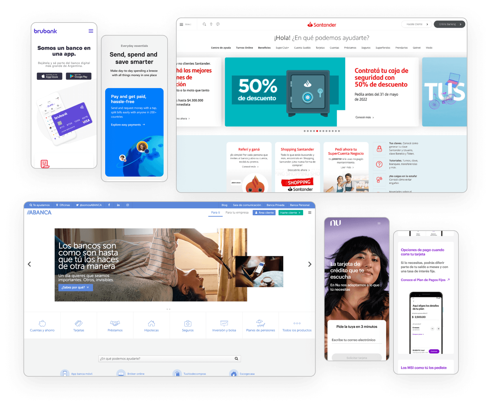
What did we find on other banks' websites?
Minimalist and modern design with a grid of rounded cards used to display benefits, promotions, products, and/or services.
Traditional banks have a complex system of menus and submenus, requiring quick access to main pages.
Clear and immediate identification of help and customer service sections is essential.
Use of clear and user-friendly language is a common practice.
What pages are common to all branches?
Homepage with variations for Personal and Business
Products and Services: Loans, Cards, and Accounts
Online Banking and Mobile Banking
Promotions
Communications: Press Room and Blog
Customer Service: Help Channels and Contact
Branches
About us
FAQs
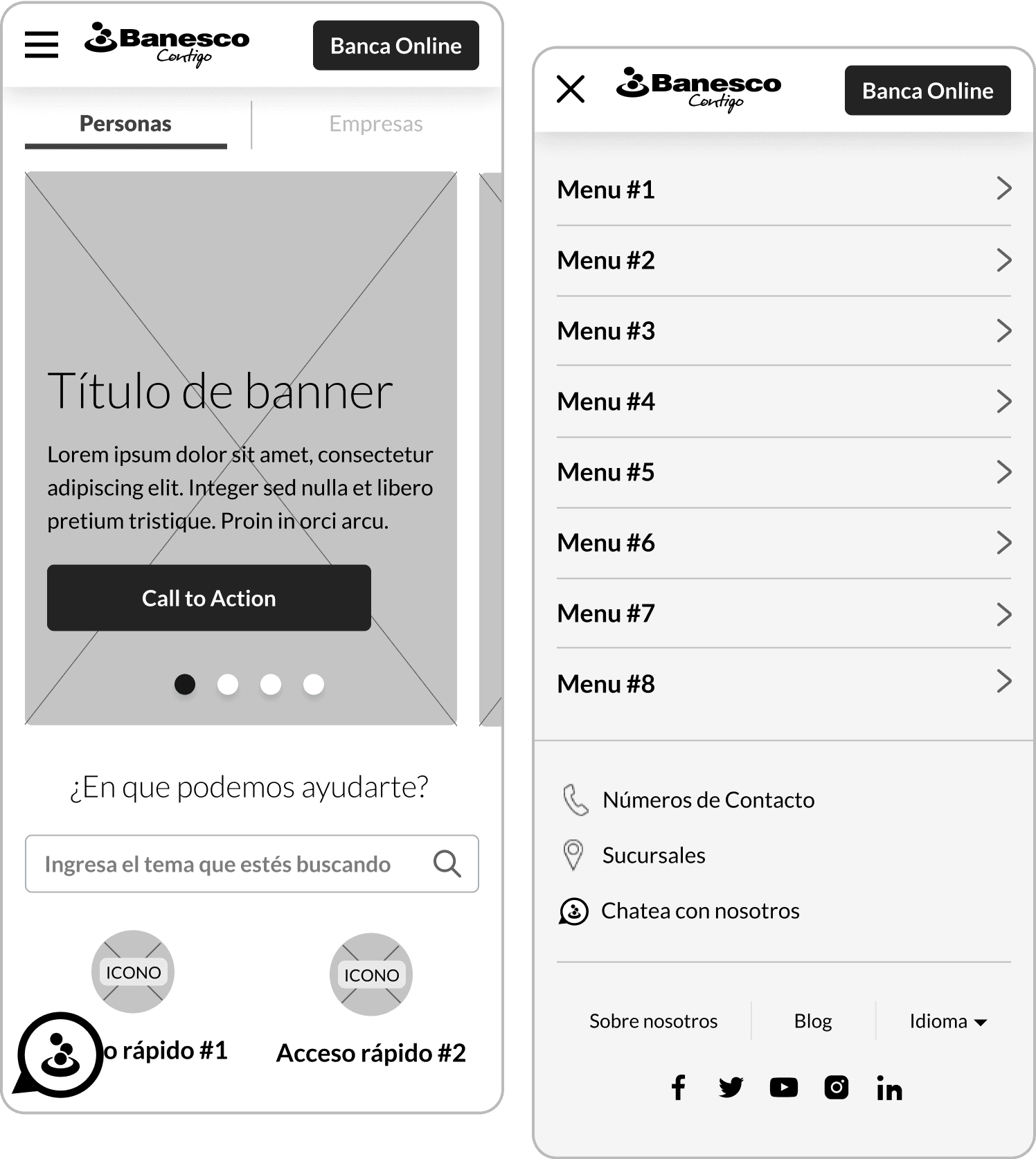
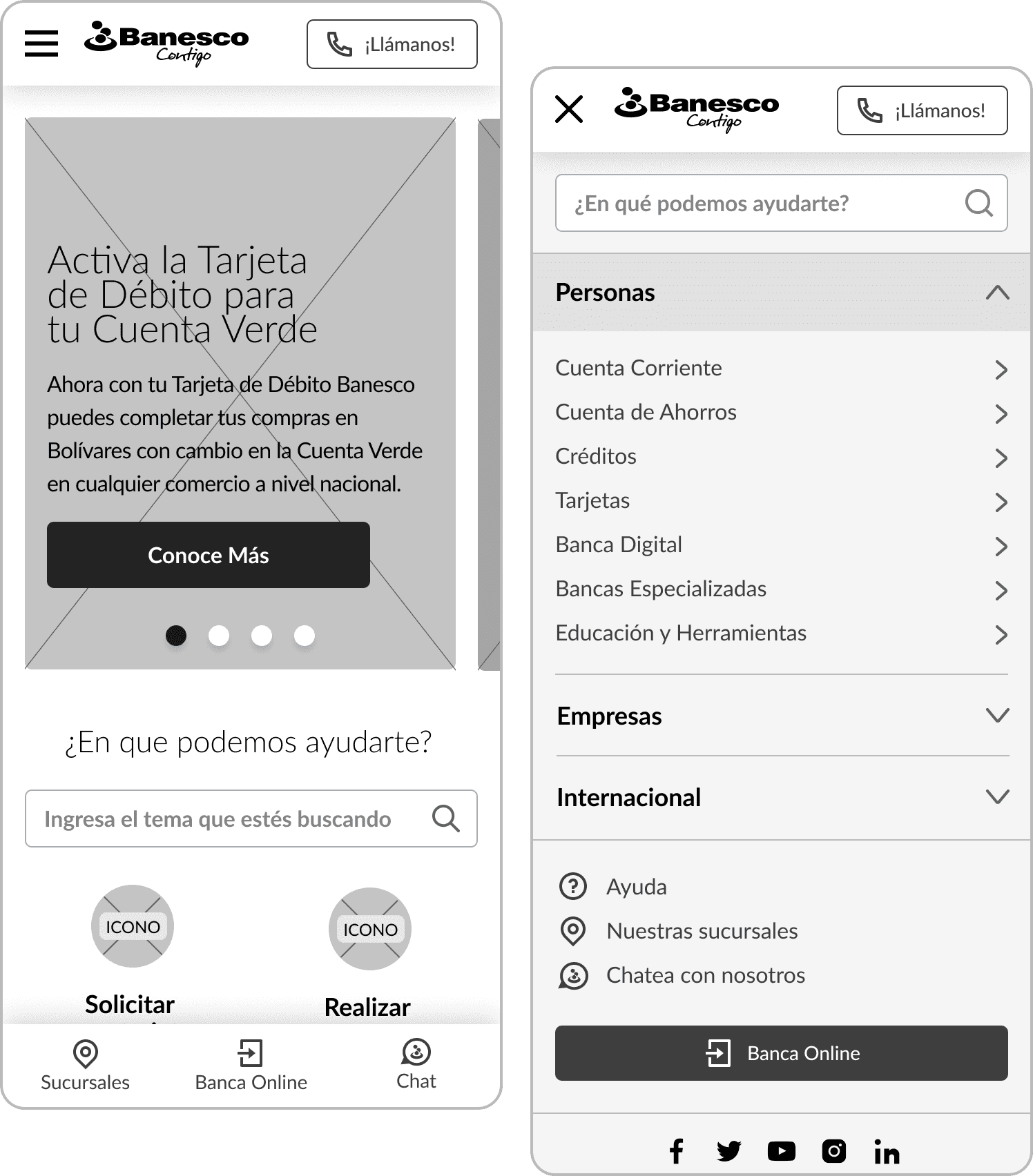
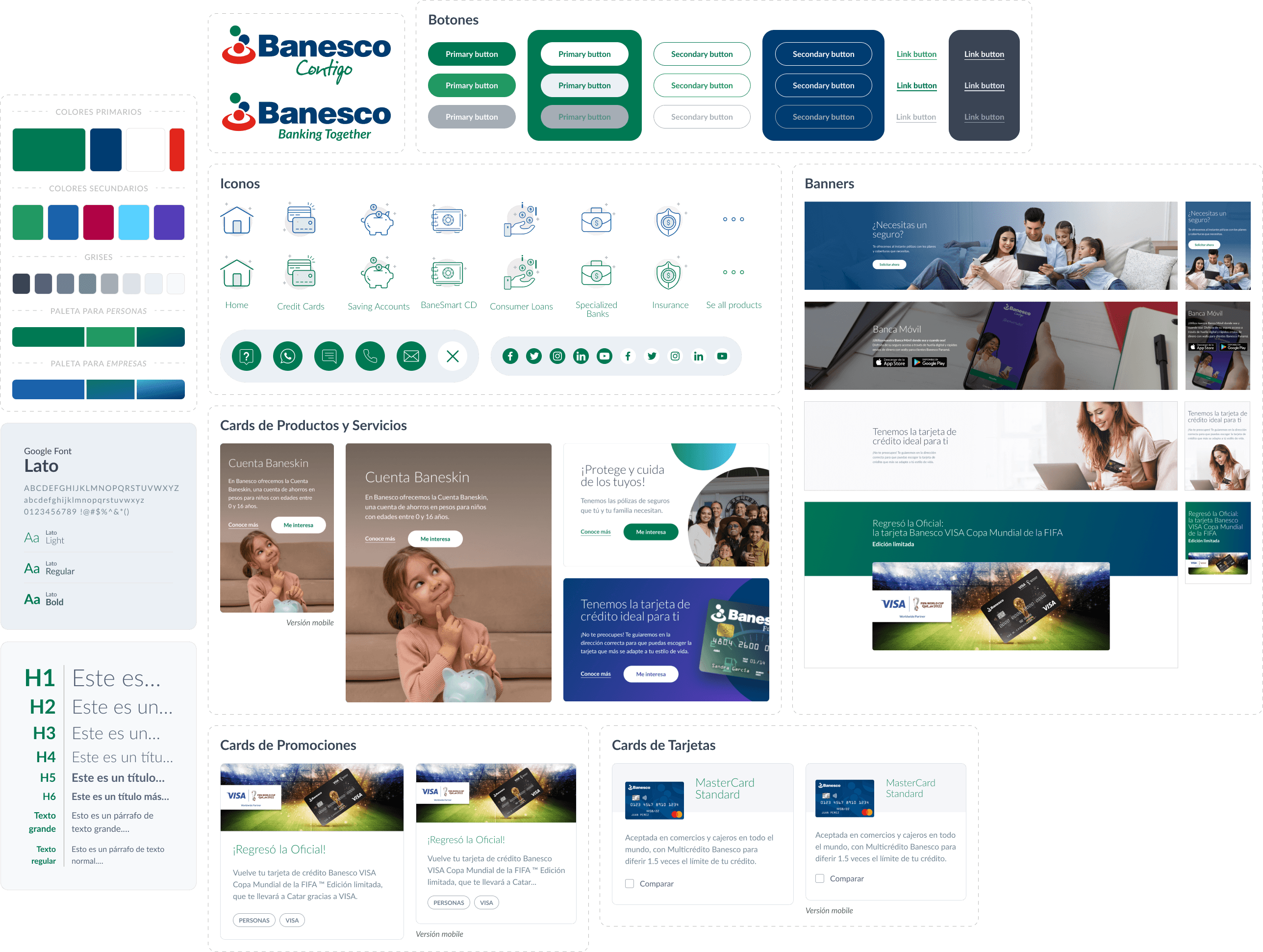
After defining the sitemap and common sections for content customization by each branch, we worked on wireframes for both mobile and desktop versions, exploring and presenting different menu, header, and banner proposals. We then moved on to high-fidelity mockups, starting to develop the design system with text styles, iconography, color palette, and various components.
Solution and results
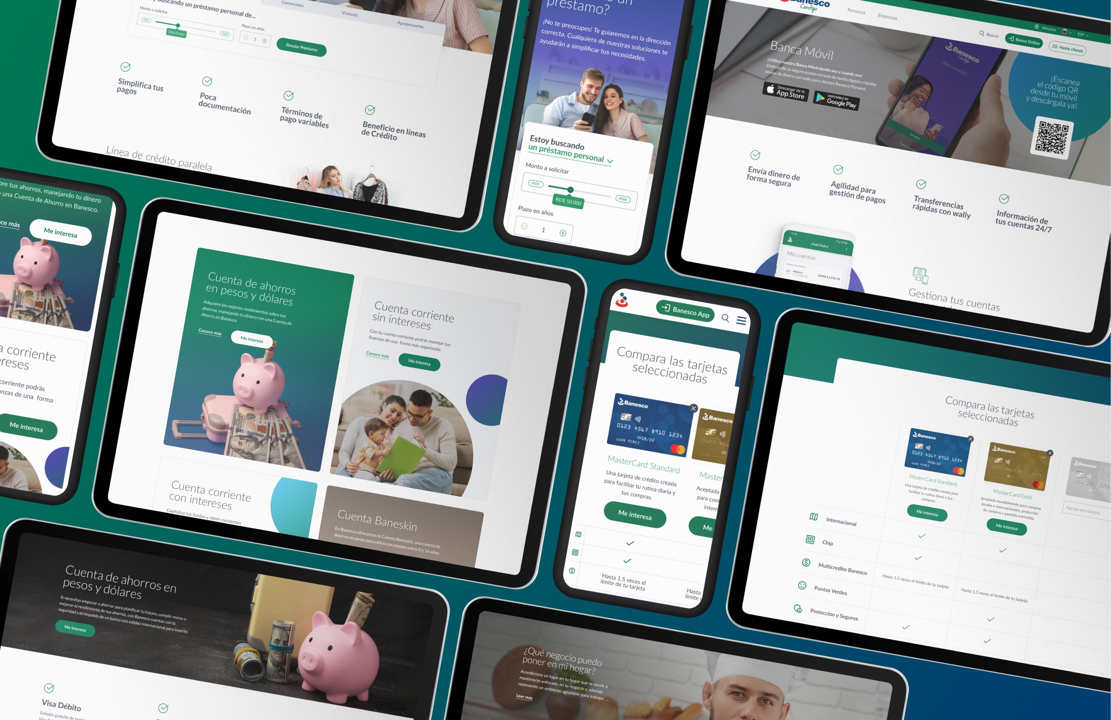
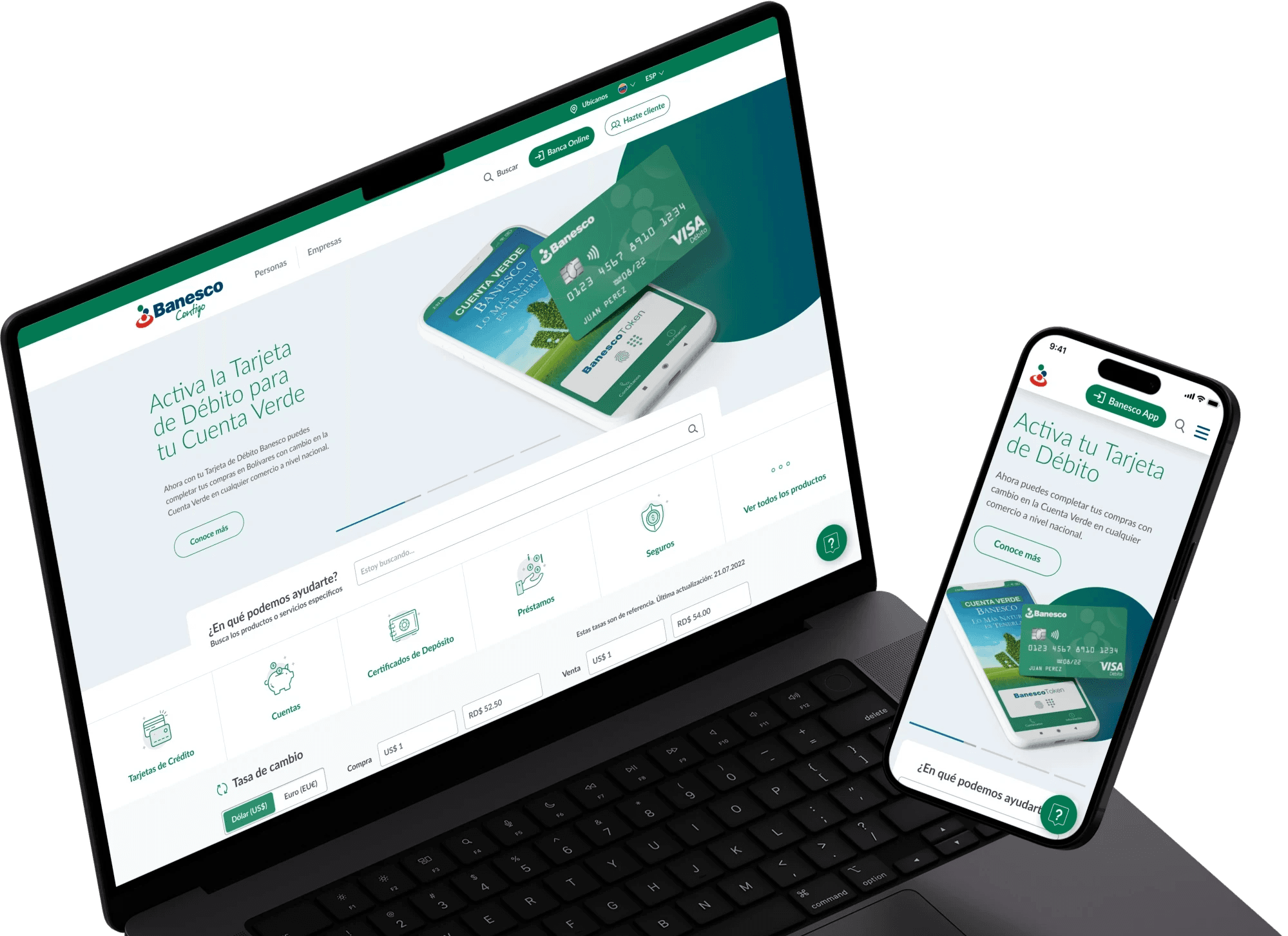
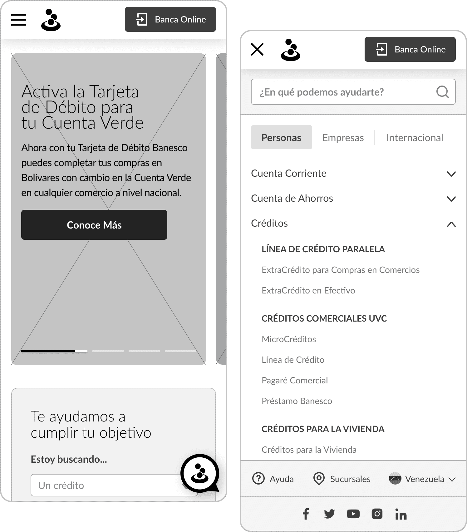
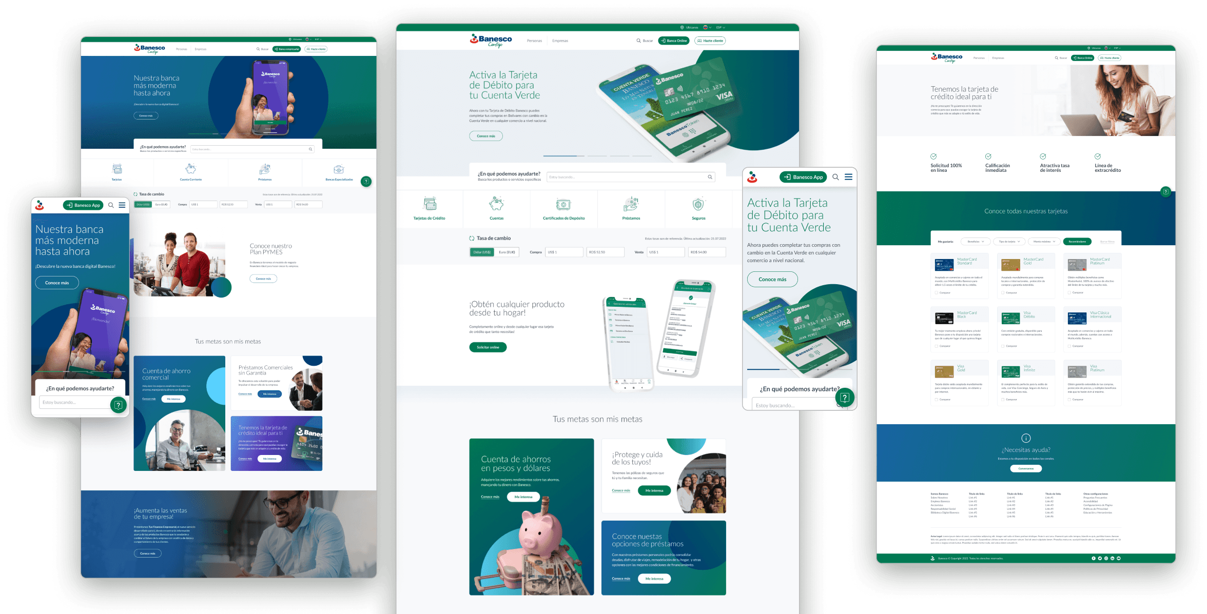
We designed templates for different types of page (home page, category page, product page, help, etc.), featuring reusable modules and components to enable content customization by each branch. Sections can be easily reordered and swapped. A comprehensive design system was created as a guide to all branches in utilizing these sections and integrating their own content to meet specific site requirements.
This approach involved creating different versions of banners, card grids for various products and services, features and benefits sections, accordion systems with collapsible information, and many other components.
Based on the new design system, all assets were delivered to the development team to build editable blocks for WordPress. The builder was then used to create the pages required by each branch, allowing for the addition or removal of sections and customization of the content within each block. A style guide was also provided to all branches to ensure consistency in the creation of each page.
As a result, we obtained a customizable WordPress template, based on the developed design system and integrated with the builder's blocks, adaptable to the content that each branch needed to implement.
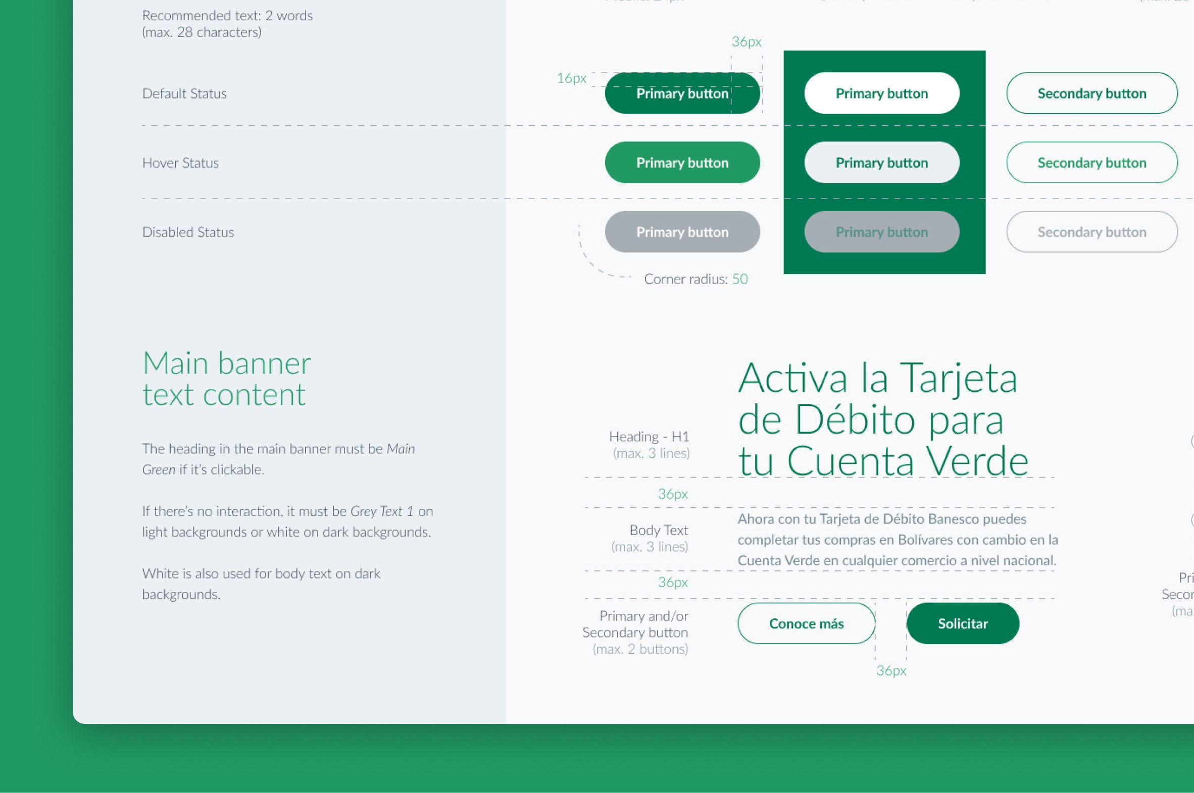
A single style guide for all branches
We developed a style guide outlining the proper usage of logos, colors, typography, and components in various states, including specific details on sizing, spacing, padding, and margins.