Choose2Rent offers event equipment rental services, including tablets, routers, printers, and guest check-in pedestals.
Project summary
Choose2Rent specializes in providing technology solutions for events, offering a wide range of rental products and services to streamline the attendee registration and check-in process for any type of event, from conferences and conventions to trade shows.
The client wanted a complete redesign to modernize and unify the entire website, with a focus on making it easier to find information about their rental products and services, and to simplify the process of requesting a quote.
OUR GOALS

Problem
We started off with a big problem: we didn't have much information to go on, and we were up against a tight deadline. The challenge was to start from a WordPress template to speed things up, but without losing the possibility of customization to achieve a unique site.
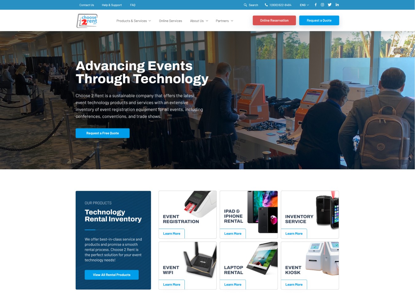
The original website had two main issues: a functional issue due to extremely slow loading times, broken images, and broken links; and a visual design issue: it was very inconsistent, with many different elements and styles, resulting in an overwhelming visual experience. The high level of inconsistency could make users feel like they were on a different site when moving from one page to another, and the excess of elements caused them to compete with each other, making the information hierarchy unclear.
Furthermore, we found that the process of requesting a quote was long and complicated, with many required steps and fields to complete, all concentrated in a form that opened on a different site, which could generate mistrust and interrupt the user's navigation flow. Additionally, the presence of two CTAs in the header was confusing and it was not clear which one was the primary.
Performance issues, including slow loading times, broken images, and malfunctioning links

Lack of design consistency and adherence to standards

Cluttered design with too many different elements competing for attention

Complicated and time-consuming process for requesting a quote
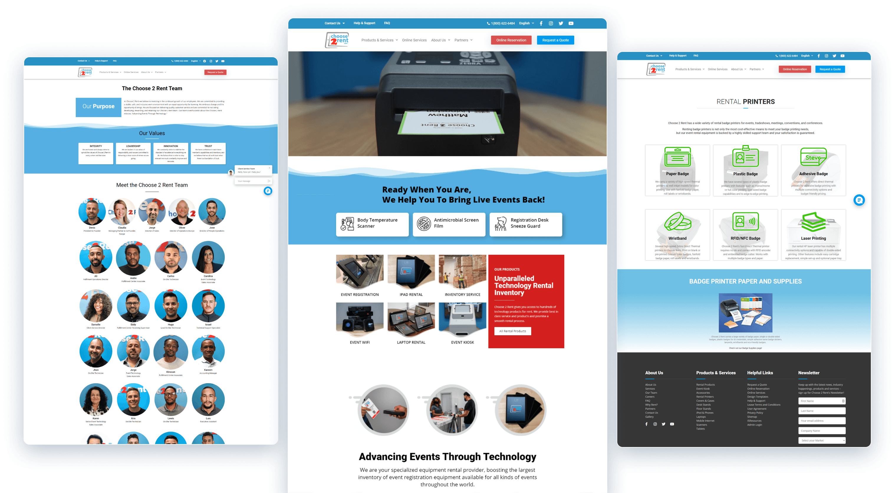
The old website suffered from information overload and a lack of visual consistency.
Design process
Given the tight deadlines and limited resources for user research, we focused on a comprehensive audit and heuristic analysis of the existing website, identifying flaws and opportunities to improve user experience and usability. Additionally, we reviewed various competitor websites and even those of the client's partners, which provided services related to event organization and equipment.
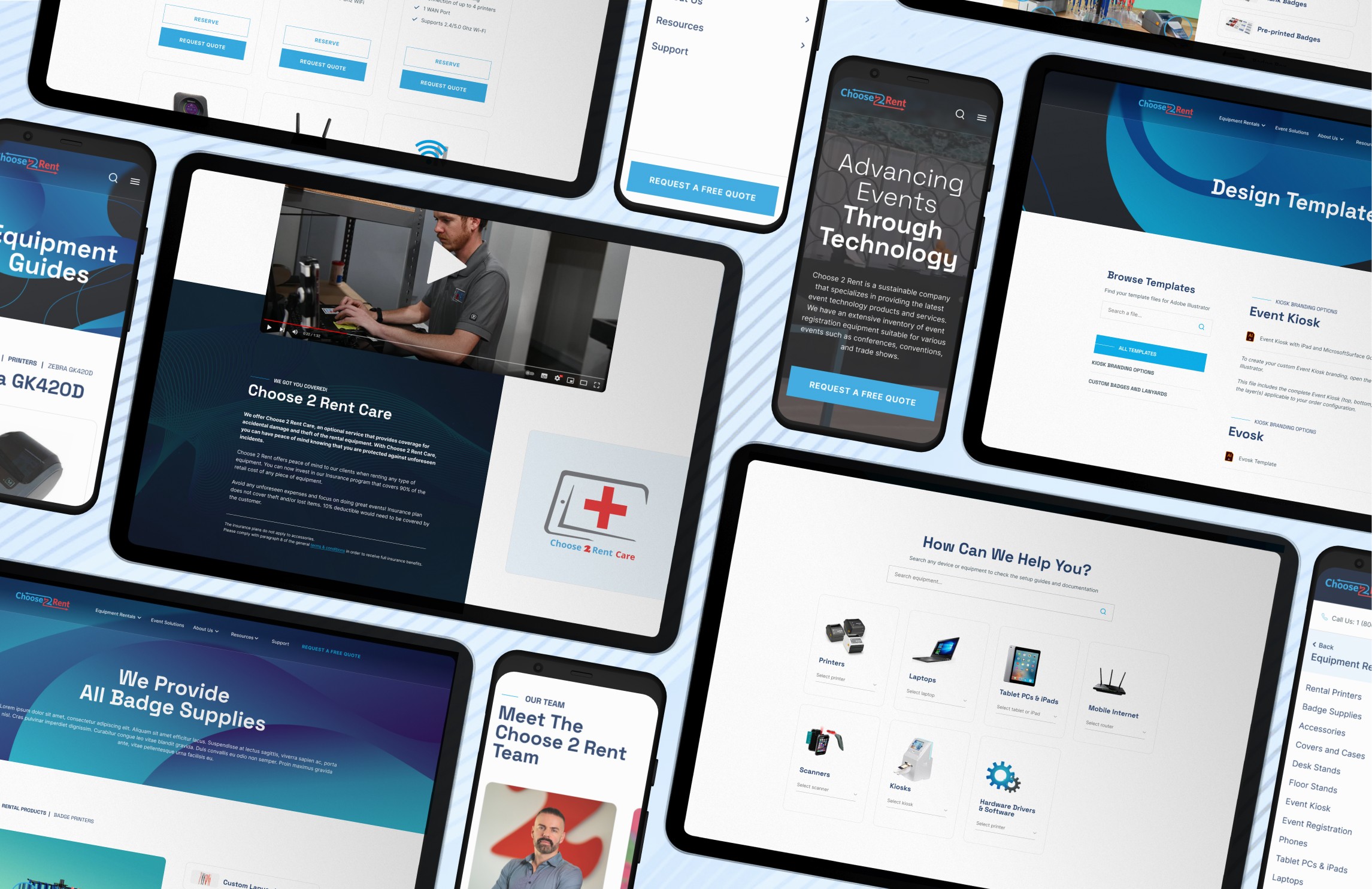
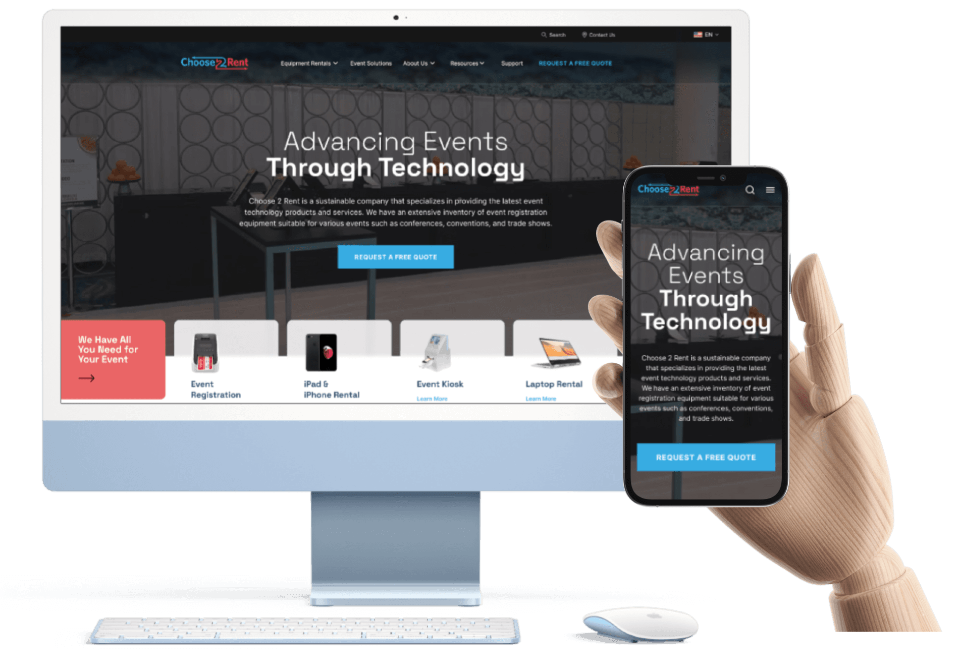
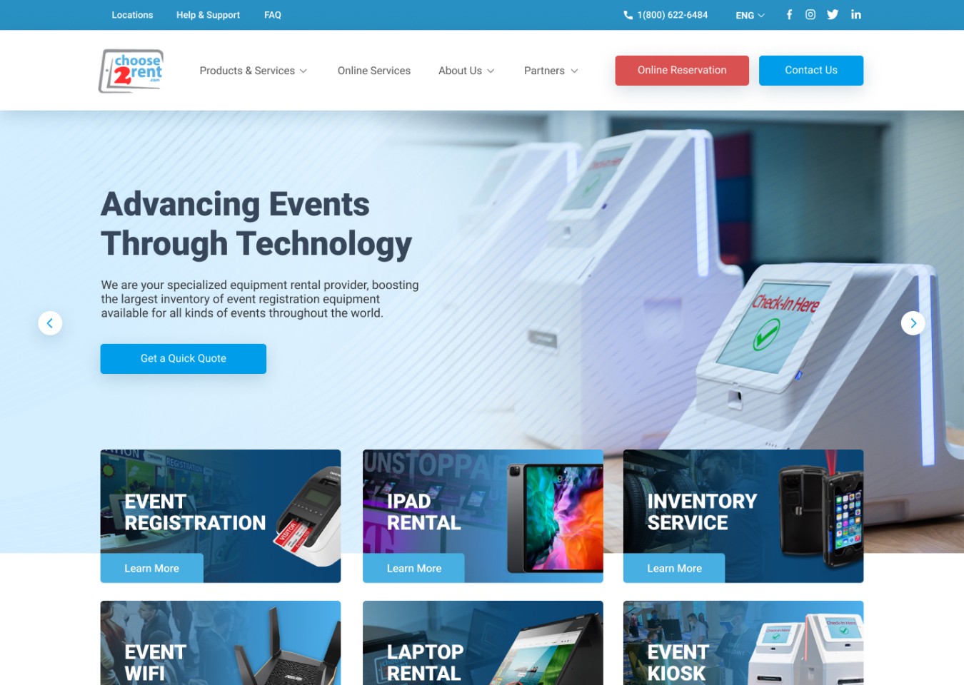
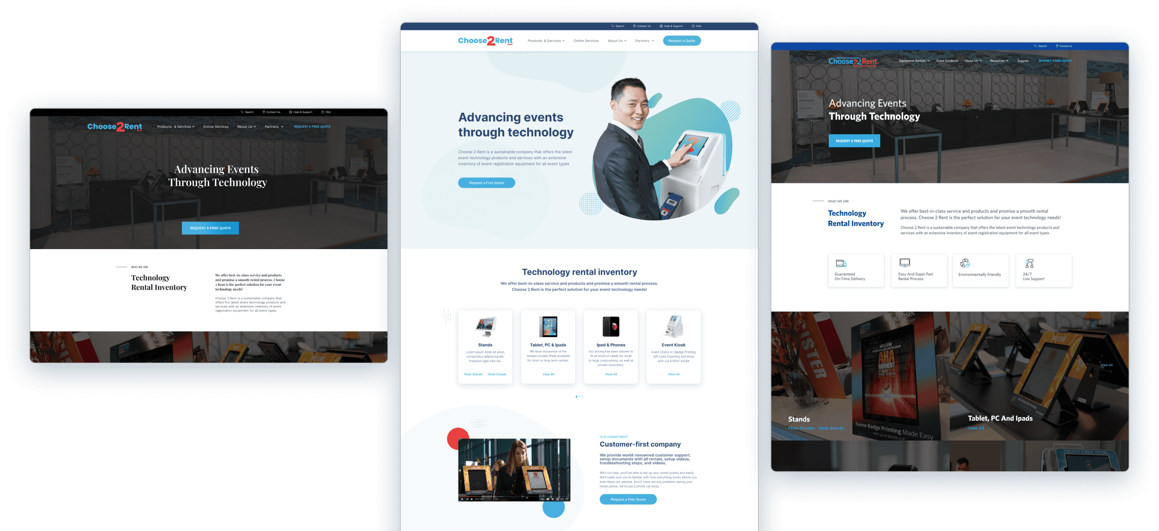
Initially, we worked on a wireframe for a first proposal of the homepage, which was then provisionally used to replace the previous site's homepage. This was an urgent matter due to the malfunction of the previous page, so we optimized images to reduce loading times, simplified all sections, and added quick access to the main products and services offered.
Meanwhile, we explored various WordPress templates to use as a foundation for the website's structure and to create the different reusable modules and components, customizing them with the client's new branding.
At the same time, we worked on the information architecture, reorganizing and renaming all the pages within the menu to make it more intuitive and easier for users to find each type of product. We also increased the visibility of the support and help pages.
Once we chose a template, we designed the homepage mockup, tailoring the components to our specific needs. Additional components were created to fully meet the site's requirements. The remaining internal pages, including contact and reservation forms, and product-specific pages (printers, scanners, tablets, etc.), were then designed.
After receiving approval, our developers customized the template's components. The design team then utilized the WordPress builder and the created blocks to construct the pages.
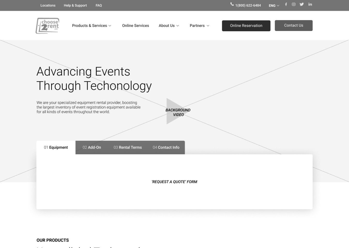
Some of the different options explored with WordPress templates.
Solution and results
Once we defined the content for every page on the site, we needed to adapt it to the chosen template using modular components that could be reused throughout the website.
To achieve this, we defined all the components and their various states in Figma, along with text styles and color usage. This comprehensive UI kit served as a blueprint for developers to customize the building blocks that would ultimately be used to construct all WordPress pages.
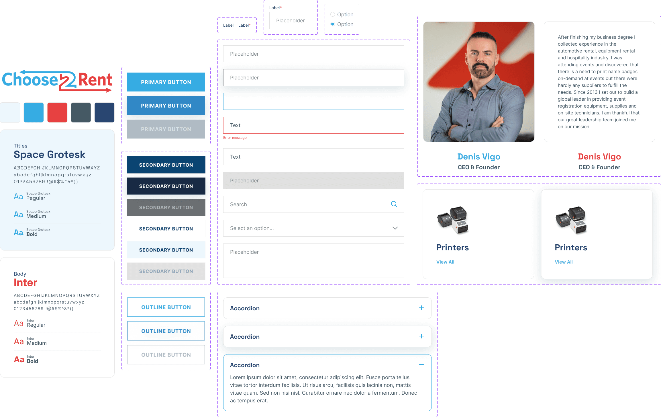
This UI kit helped us maintain consistency throughout the website and ensure a unified visual style with a consistent color palette, limited typography, and well-defined text styles for each content type.
Our primary goal was to improve the accessibility, readability, and clarity of information about services and rental products. We also simplified and streamlined the forms and renting process to provide a user-friendly experience.
Además de la homepage, se diseñaron y crearon en WordPress las más de 50 páginas internas que consistían en las páginas de cada tipo de producto, los servicios ofrecidos, el blog, galería de imágenes, las páginas de ayuda y soporte, entre otras.
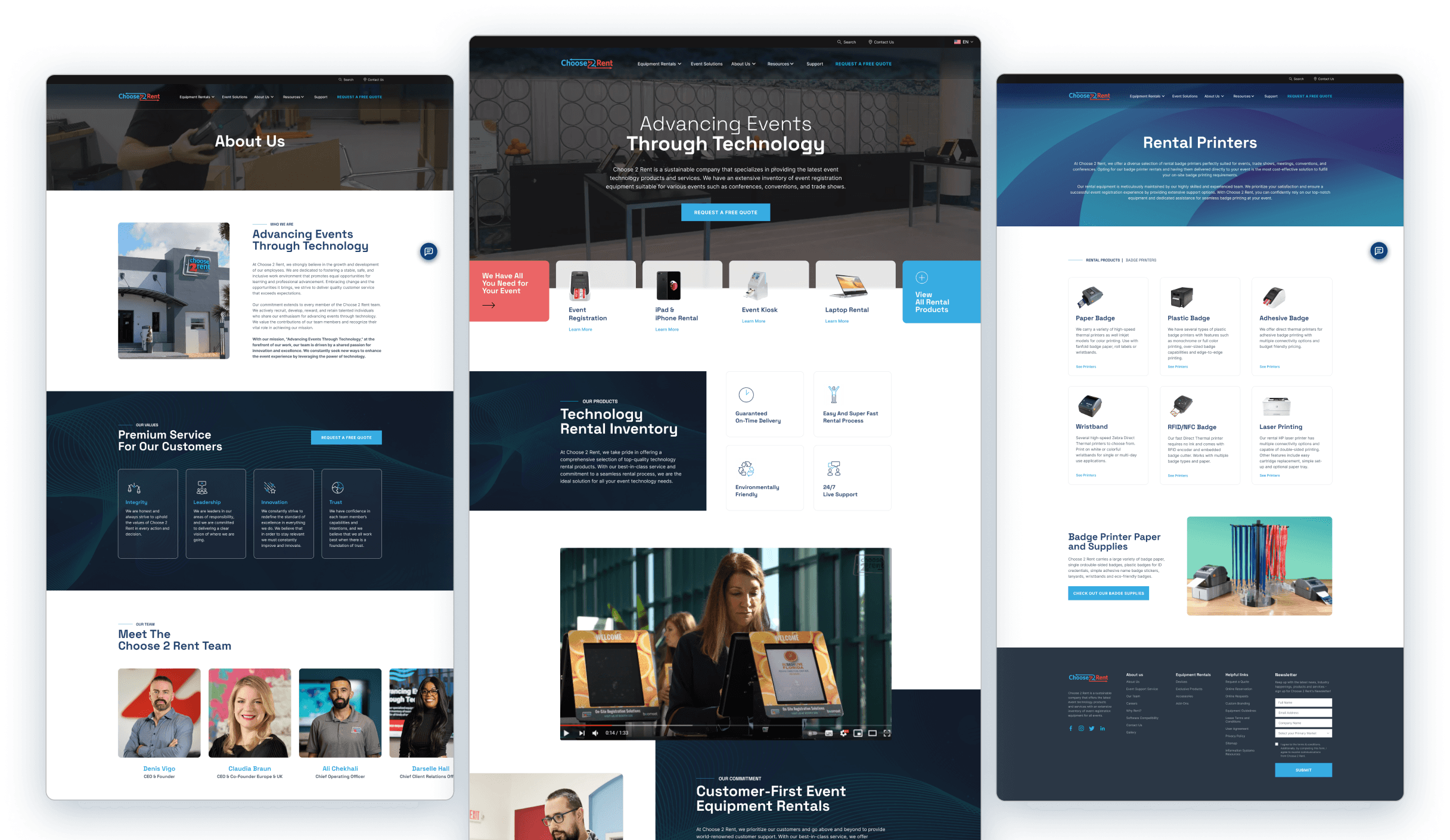
In addition to the homepage, we designed and created over 50 internal pages in WordPress, including specific pages for each product type, services, a blog, an image gallery, and help and support pages.
The result was a complete redesign of the entire website using WordPress, which allows for easy customization, content updates, and the addition of new pages or sections.
We organized the menu in a more efficient and intuitive way
Products: pages for each type of rental product, such as printers, tablets, accessories, etc.
Servicios: all the different services that C2R offers, including event support, attendee check-in, etc.
About us: information about the company's team and work process.
Resources: blog, image galleries, and case studies with examples and testimonials.
Soporte: FAQs, contact information and equipment guides to help users solve any problems they may encounter.
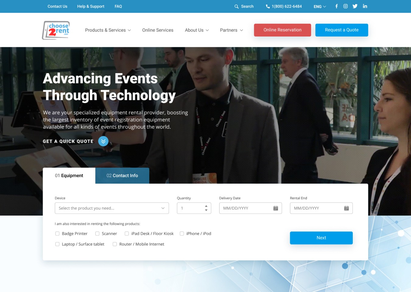
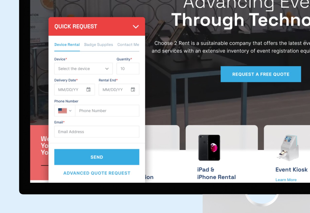
We made it easier and faster to request a quote
We use the Request a quote action as the primary call to action throughout the site.
We've designed the form to guide users through the process step-by-step, avoiding information overload.
We've included the option to choose between a detailed advanced quote or a shorter quick quote.
We've added and optimized specific forms for existing customers, such as extending rentals, requesting additional products, or reporting damages.
Quick quote tab for easy requests
We added a new tab at the bottom to allow users to easily and quickly request a quote using a shorter, more concise form.
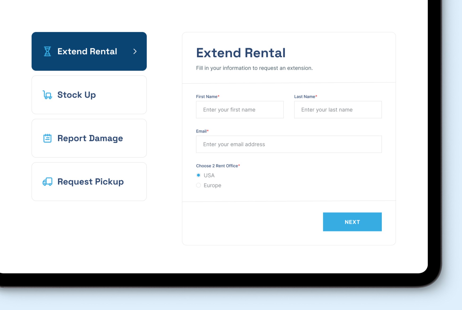
Specialized forms for different rental requests
We created a dedicated page to organize forms for customers with an ongoing rental who want to extend their rental period, request additional devices, report damages, or request pick-up of rented products.