
Difiaba is an Italian haircare brand designed for professional stylists who want high-quality products for their salons.
Project summary
Difiaba is a hair care brand established in 2006 with the mission of creating superior quality products, formulated with ingredients that promote beautiful, healthy hair.
The client sought to revamp a Shopify e-commerce site to showcase the wide range of products and facilitate purchasing for both professionals and regular consumers, with a particular focus on enhancing the user experience for mobile devices.
OUR GOALS

Problem
The visual design was inconsistent with the brand's identity and values, and the user experience was lacking, with issues in navigation and information architecture. The mobile version wasn't optimized for small screens.
The homepage didn't make a strong first impression. The banner was simple and didn't highlight any products or calls to action. The navigation was unintuitive, with all products grouped under a single Shop menu. Users had to rely on the search and filters to find specific items.

It was very difficult to navigate the site and identify the user's current page; all product categories were hidden on the Shop page, and there were no titles to differentiate categories beyond some filters.

No consistency in components, colors, and text styles.

The product information was not well-organized, making it difficult for users to compare products.

The homepage was not optimized for eCommerce, with a lack of clear product categories and a weak hero banner.
The previous version of the website had a menu and homepage that were not product-focused.
Design process
Once we had a clear understanding of the client's goals and the brand's identity, we began by conducting a comprehensive site audit and competitive analysis.
Our findings led us to redesign the site's information architecture, reorganizing the sitemap and validating the changes through a card sorting exercise. The new structure features a two-level navigation: one for product categories and subcategories, and another for shopping-related functions like registration, cart, and search.
Product categorization
In our new main navigation proposal, we've categorized and subcategorized all products to streamline the user experience from search to purchase. This allows users to quickly find what they're looking for by filtering through our menu, without being overwhelmed by too many options on a single page.
Userflow
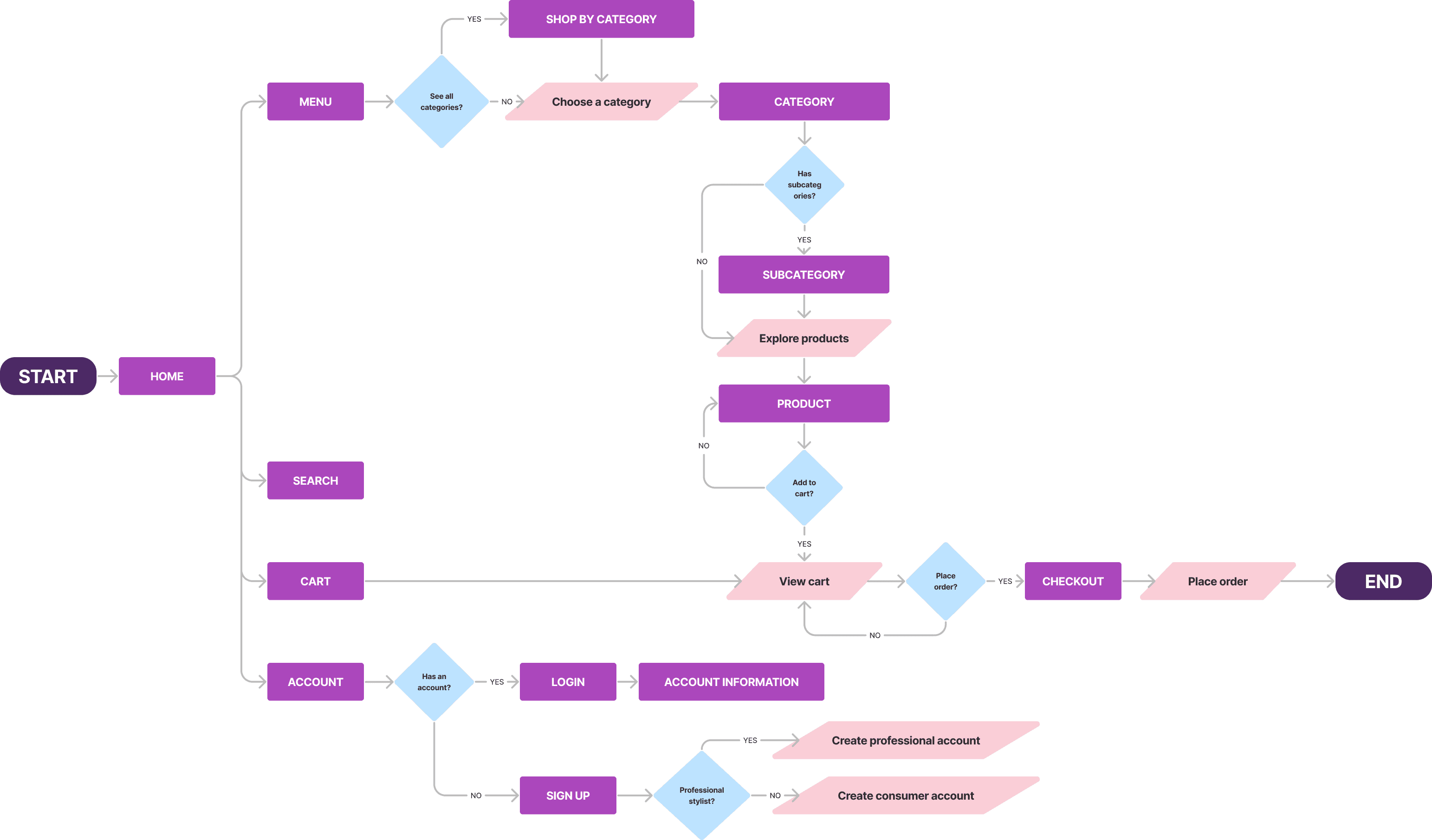
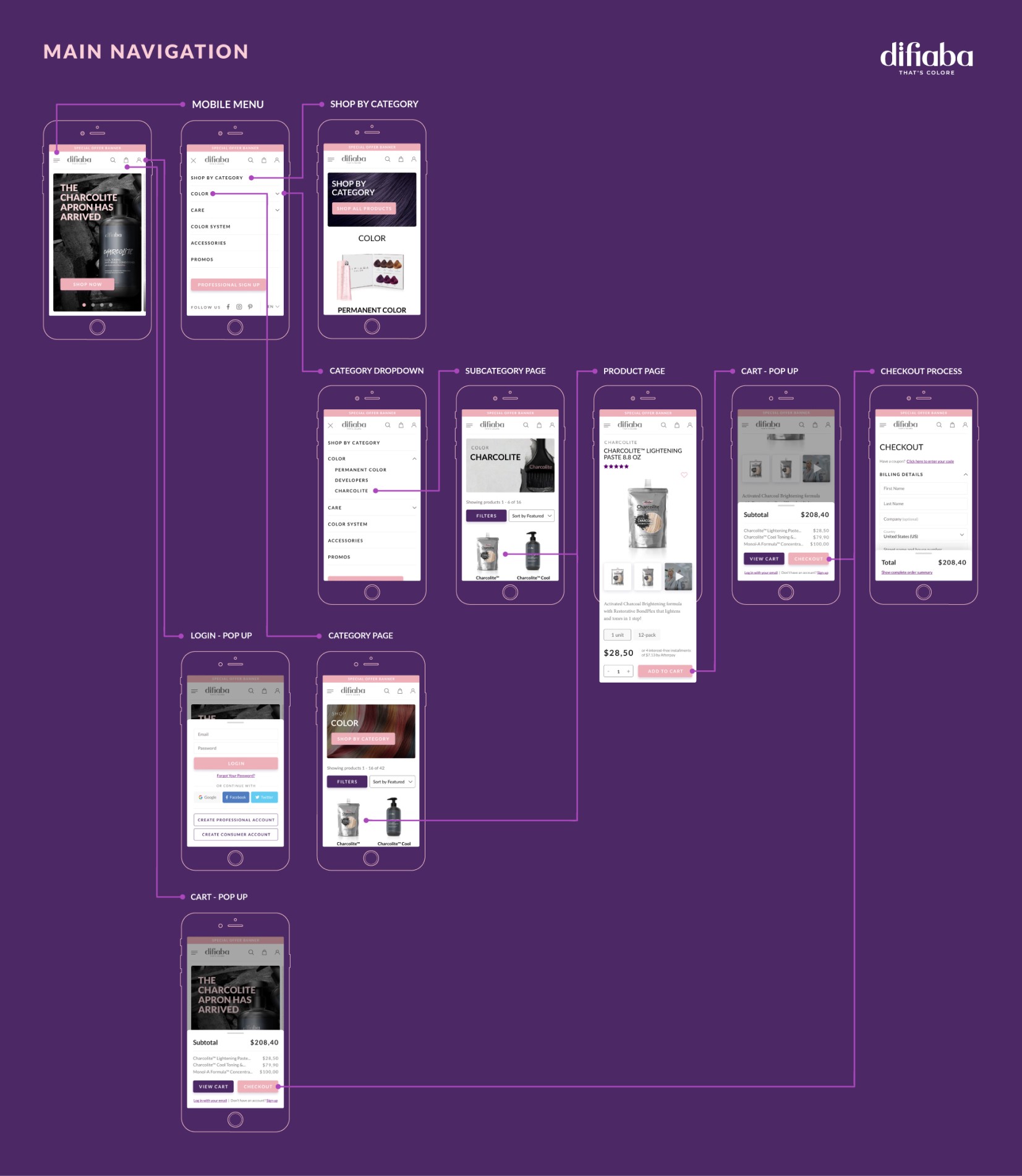
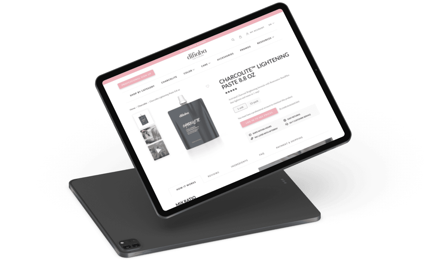
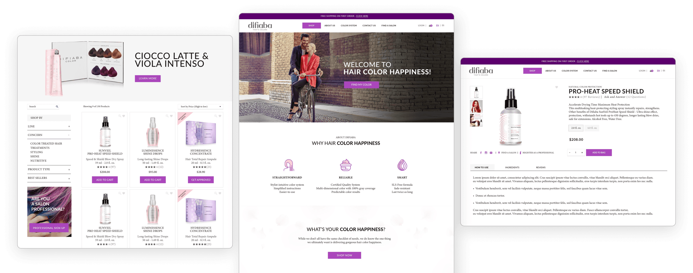
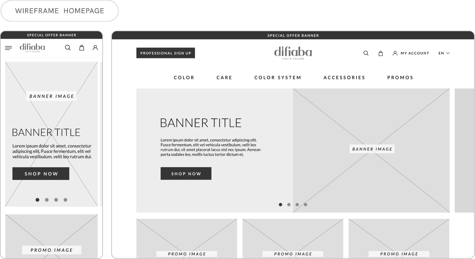
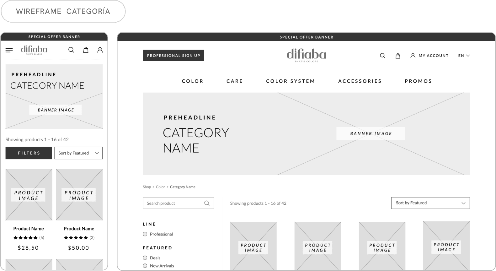
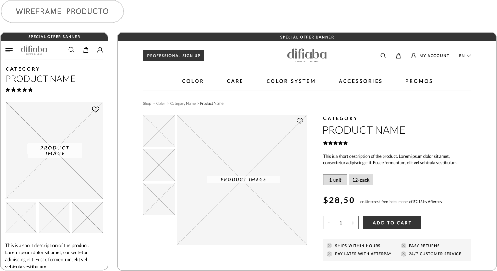
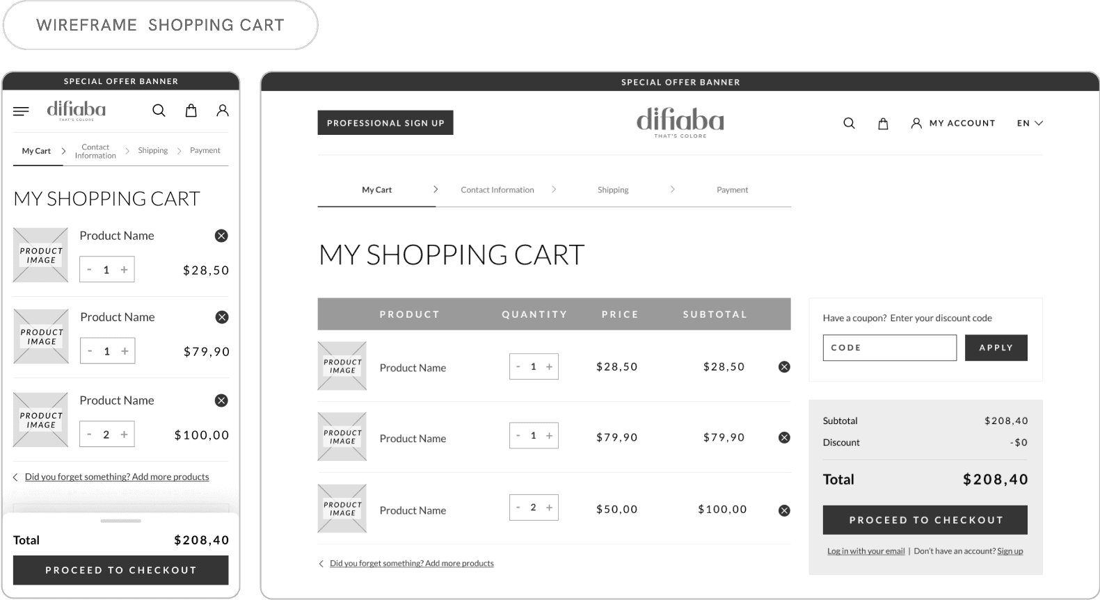
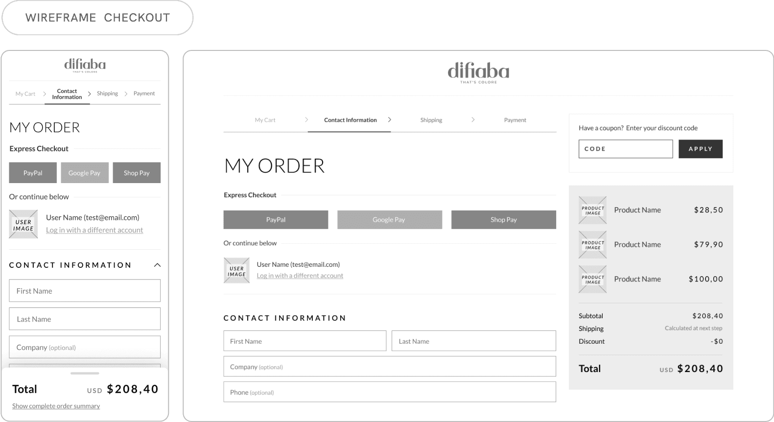
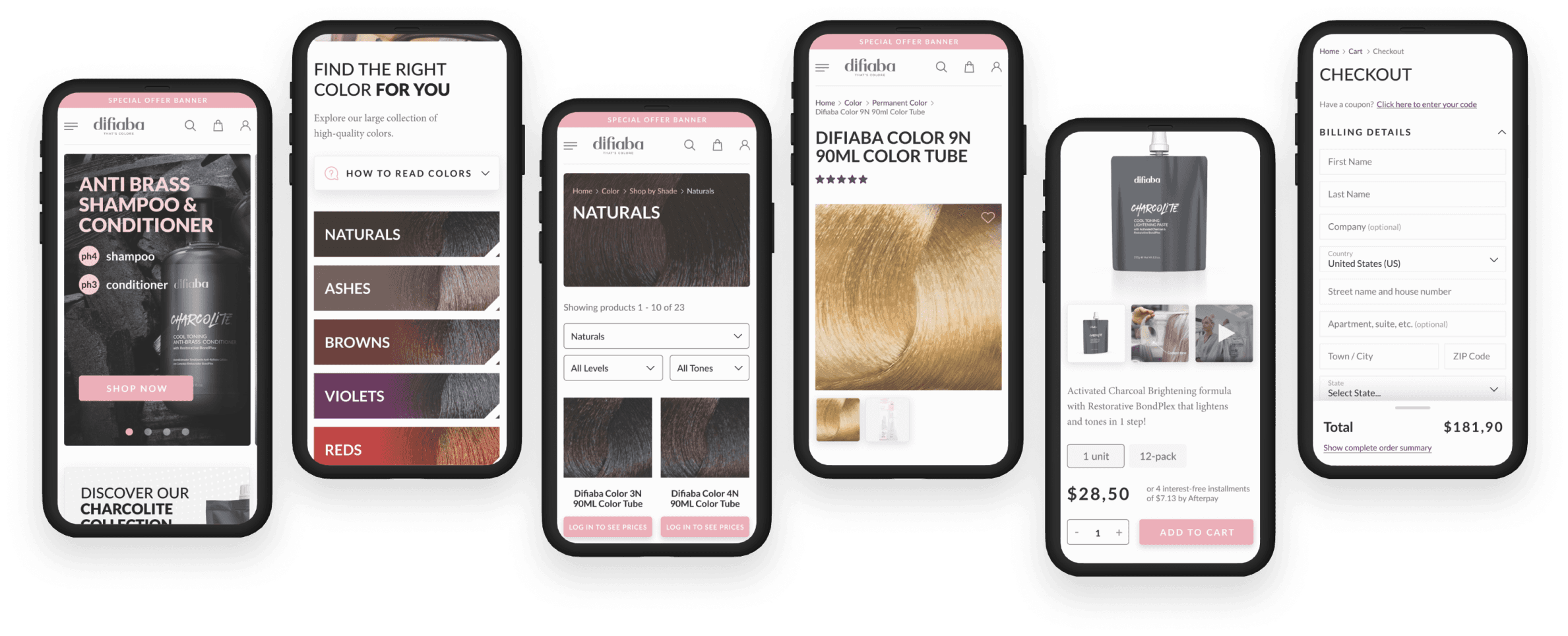
Using the new sitemap as a foundation, we defined the MVP and created wireframes for our core purchase flow screens: Homepage, Product Category, Product Page, Cart, and Checkout.
Following some wireframe adjustments, we developed high-fidelity designs, incorporating images and color while adhering to Difiaba's branding guidelines, including their preferred fonts and pastel pink color palette. We adopted a mobile-first approach to ensure an optimal user experience on smaller screens.
Once the client approved the designs, we handed off all assets to the development team and continued to collaborate to ensure a correct implementation.
Solution and results
Following the creation of wireframes to define the visual style and structure of our main pages, we designed all screens for the MVP, starting with mobile and then desktop. We focused on optimizing product discovery and the checkout process.
The result is a website that aligns with the brand's visual identity and values, offering a smoother shopping experience through small but impactful improvements.
Enhanced product search and discovery
Added a search icon to the header for easy access.
Refined category filters to include subcategories, promotions, discounts, and price ranges.
Implemented breadcrumbs to help users navigate the site and easily backtrack.
Optimized the shopping experience with simple changes
Implemented a cart pop-up to provide a quick view of the total and a direct path to checkout.
Added a sticky subtotal and cart details tab on mobile checkout for easy access while scrolling.
Allowed guest checkout for non-professional products.
Integrated popular payment methods like PayPal and Afterpay.
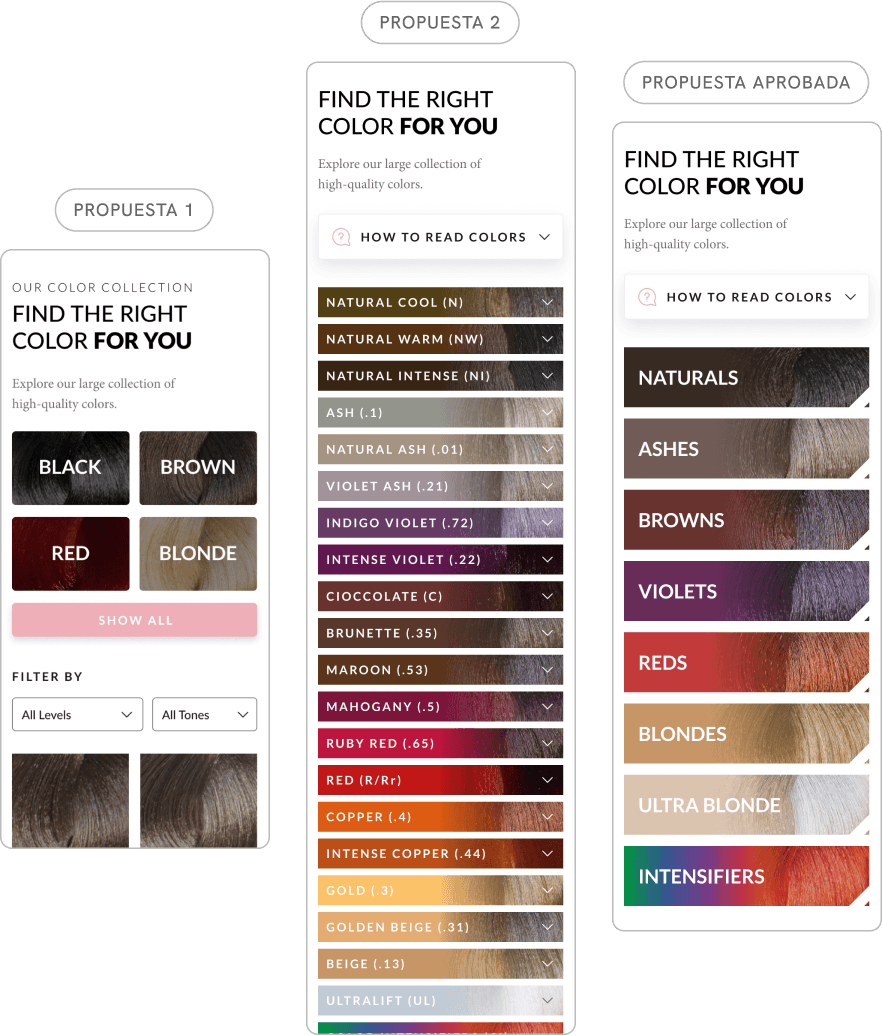
A key focus of this project was redesigning the hair color organization system for both our Shop by Shade page and individual product pages.
The previous system was overly complex, with too many color groupings that overwhelmed customers. We simplified the system by categorizing colors into broad groups like natural, brown, and blonde, making it easier for customers to find the perfect shade.
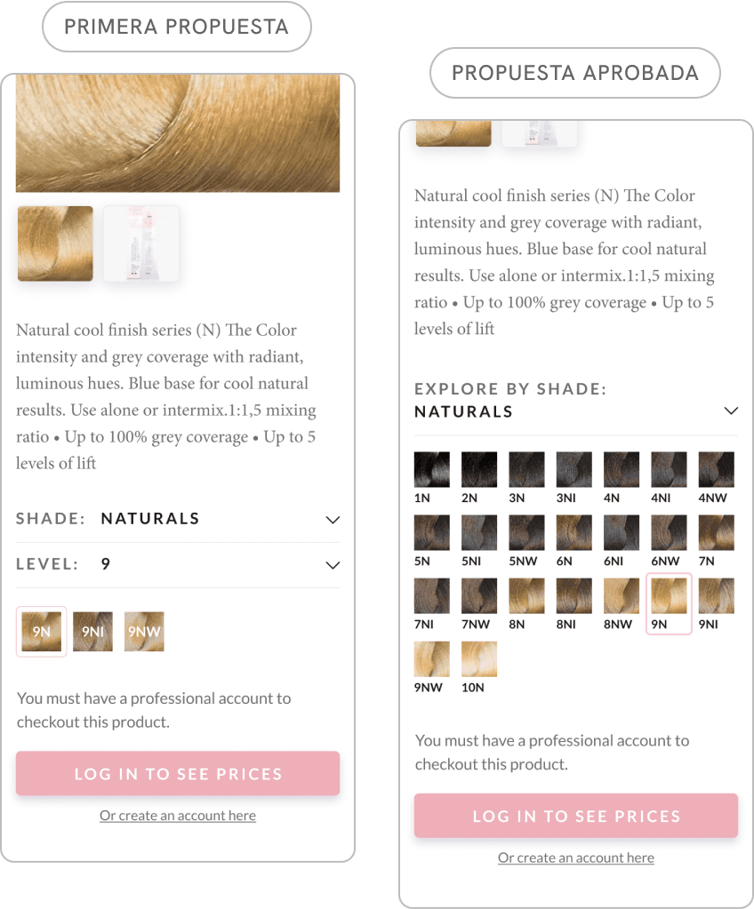
Hair color shade selector
For our product page, we aimed to create a quick and easy color selector to help customers discover other options.
Our initial design involved two dropdowns: one for shade and another for level. However, this proved to be overly complex. So, we simplified it to a single dropdown that displays all color options within a chosen group by default. This allows customers to quickly compare and select their preferred color.