
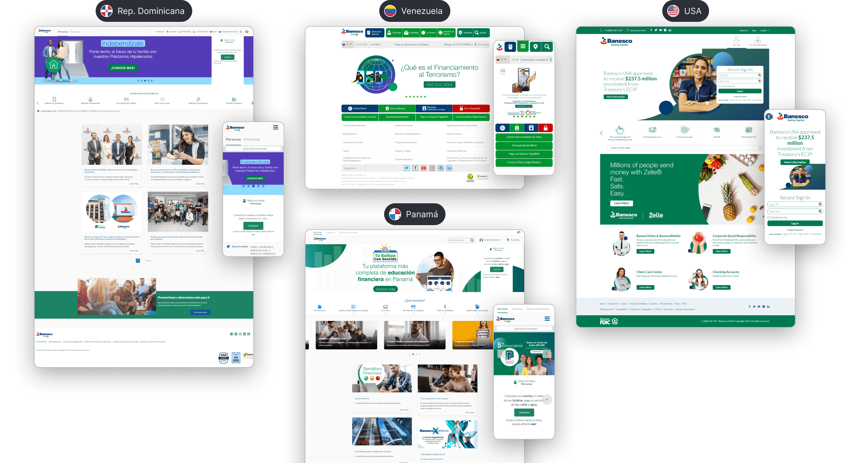
Unified branding and websites for all Banesco Internacional locations: Venezuela, Panama, Dominican Republic, and the United States, creating adaptable templates for the content of each one.
Project overview
Banesco International is a corporation with presence in different regions and markets in South America, Central America, North America, and Europe, whose bank has branches in countries such as Venezuela, the United States, the Dominican Republic, and Panama.
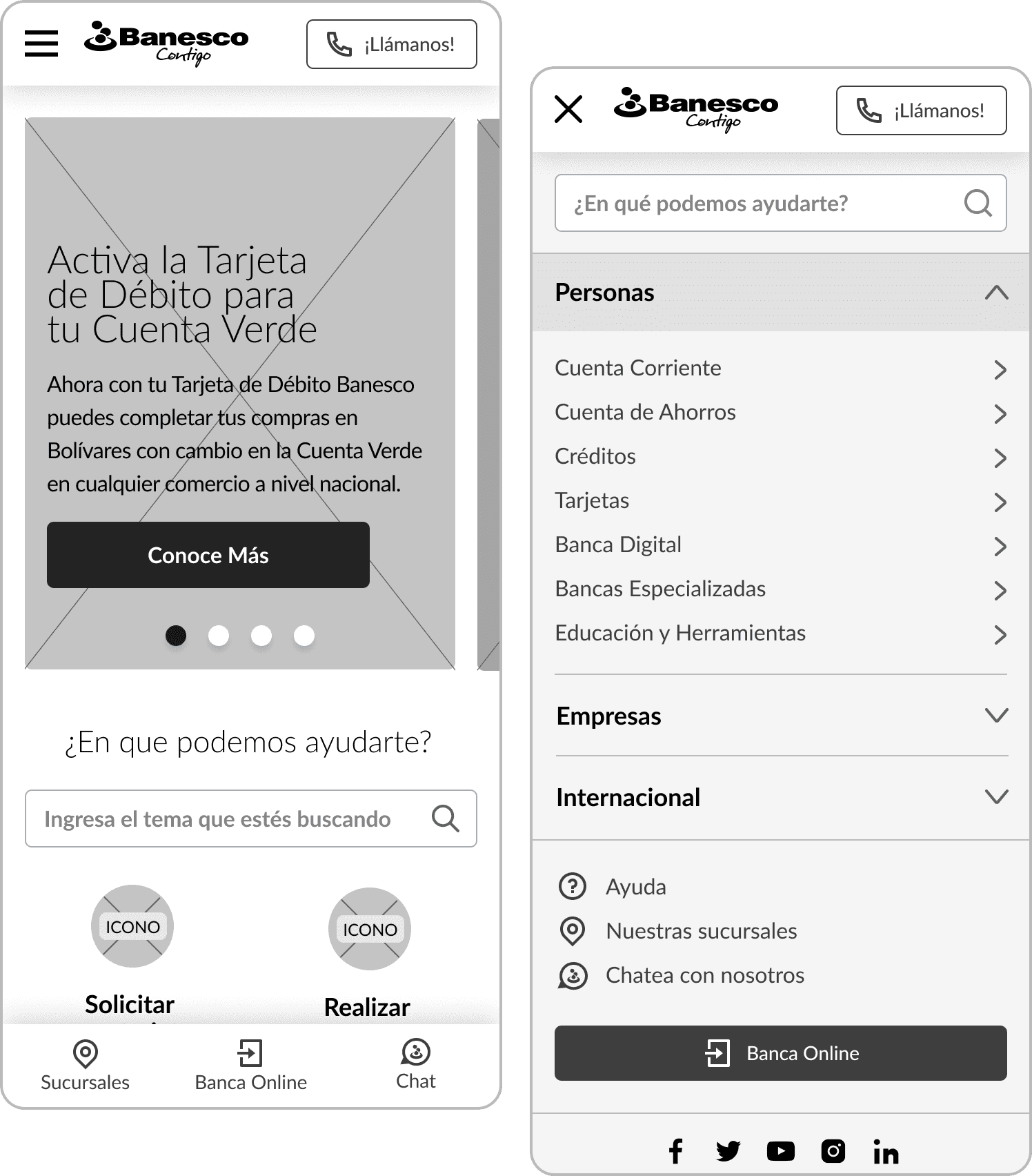
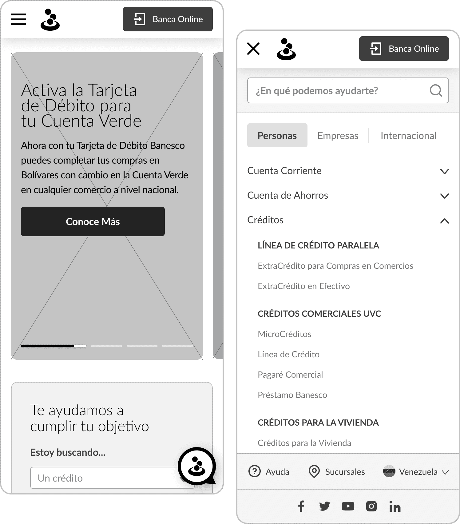
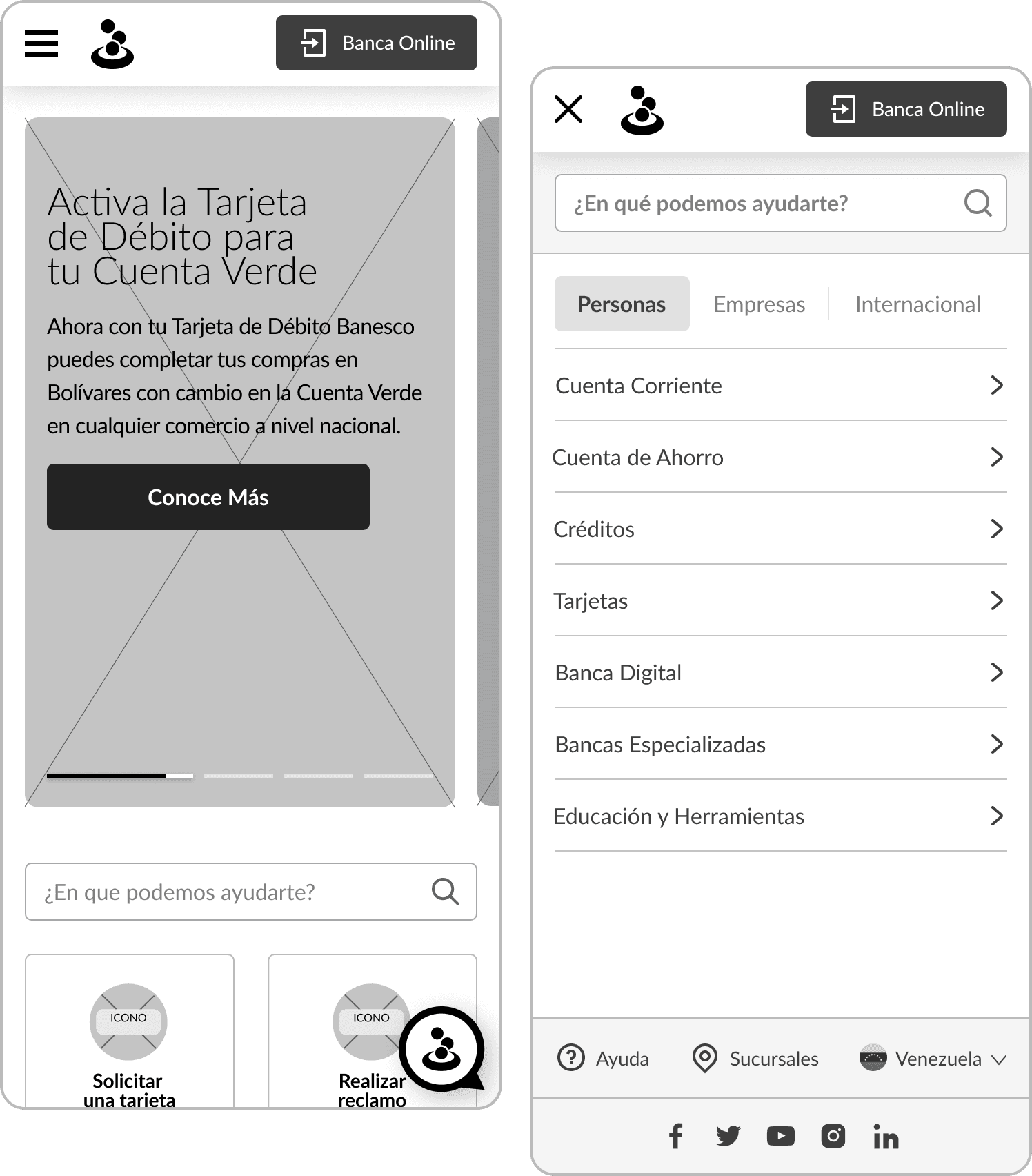
The project consisted of unifying the branding and websites of the 4 mentioned branches, creating customizable templates adaptable to the different contents. Each branch presented very different interfaces, with different structures, pages, menus, and tools.
Our goals

Problem
The main problem that occurred throughout all the sites was the absence of an established design system for all the locations to share and use as guidelines to maintain consistency. Only a brand manual was available, focused mainly on the correct use of the logo and brand colors.
This generated a high level of inconsistency, not only when comparing the locations with each other, but also within each of the websites, by not making a coherent and regular use of different element sizes such as buttons, texts, titles, or links, not following a grid to organize the columns, cards, and information, or not correctly using the colors established in the brand manual. In addition, there was a need for mobile optimization, as texts and buttons that were too small could be observed, as well as images that were covered by text when their size was automatically adapted to small screens.

Inconsistency in not using the same design system across all locations

Components and sections without structures or replicable patterns

Information without hierarchical organization

Lack of optimization for mobile versions
Previous websites of the four locations: Venezuela, Panama, Dominican Republic, and United States.
Design process
Once the general audit of the four headquarters was done, we carried out a competitive analysis of traditional banks such as ABANCA and Santander, and digital banks like Brubank and Revolut, to find common patterns and structures, identify what worked and what could be improved.
Then, we needed to identify the common pages and subpages among all the sites to define a sitemap that encompasses the maximum possible options and thus create templates that would serve as a base for reuse on all sites. Also, we had to identify common information and sections on each page, to decide what type of component or module we would need for each case. For example, we found that on the card pages, we needed to implement, at a minimum, sections to show the requirements, benefits or advantages of the cards and the instructions to request them.
Some of the websites of the competition, both traditional and digital banks.
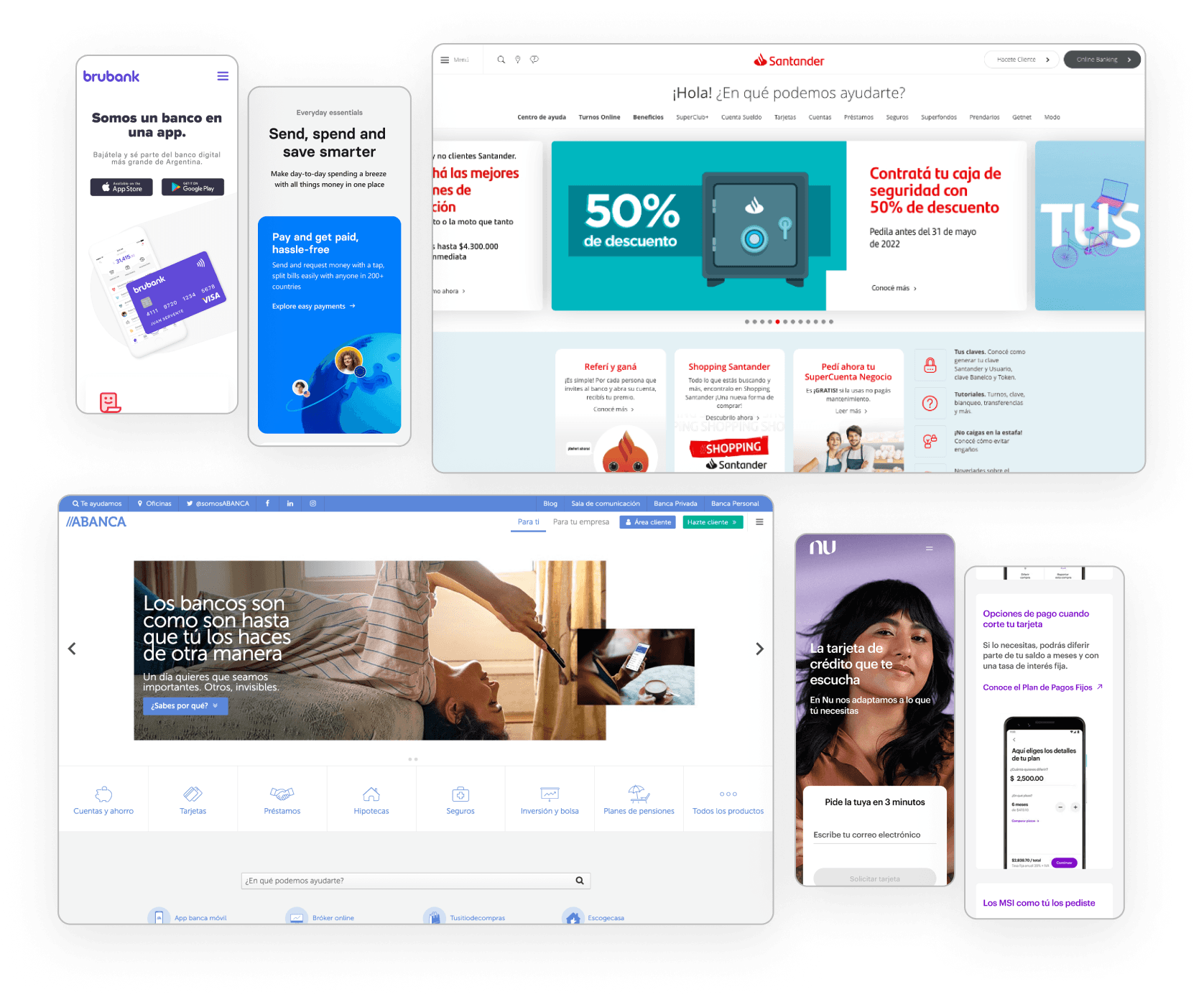
What did we find on other banks' websites?
Minimalist and modern design, with a grid of cards with rounded edges, used to display benefits, promotions, products, and/or services.
Traditional banks have a complex system of menus and submenus, requiring quick access to main pages.
Clear and quick identification of help and customer service sections.
Clear and friendly language for the user.
What pages do all the headquarters have in common?
Homepage with variations for Personal and Businesses
Products & services: Loans, Credit cards, and Accounts
Online Banking and Mobile Banking
Promotions
Communications: Press Room and Blog
Customer service: Help Channels and Contact
Branches
About us
FAQs
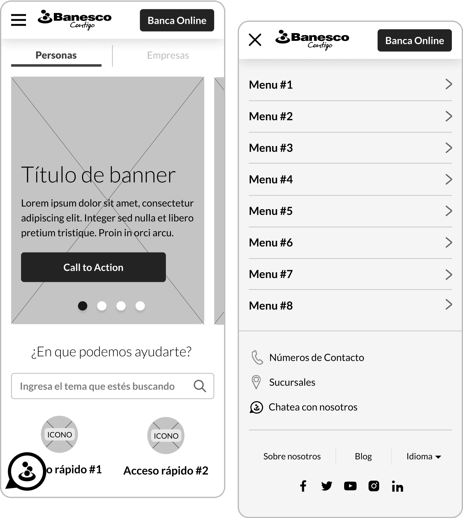
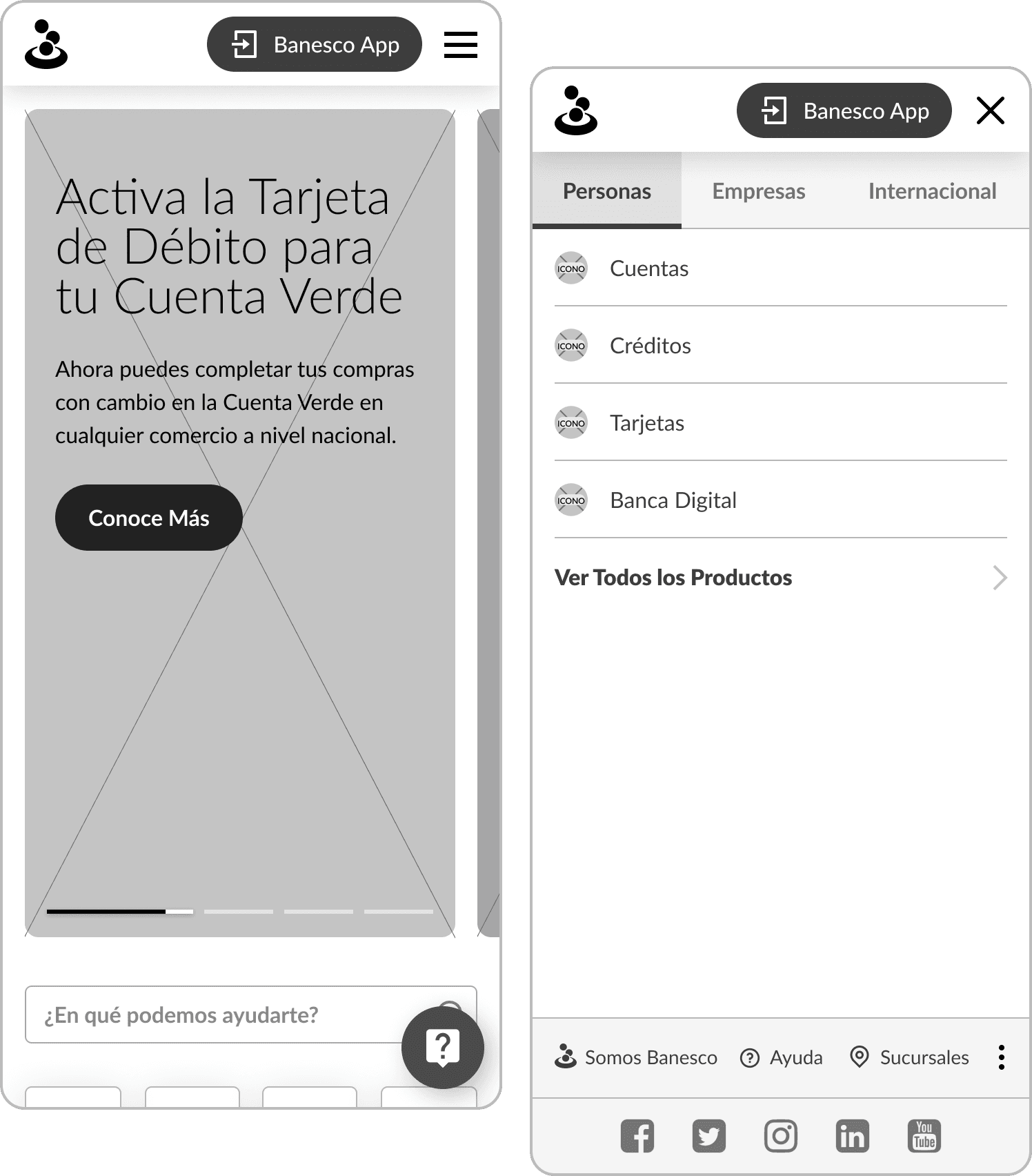
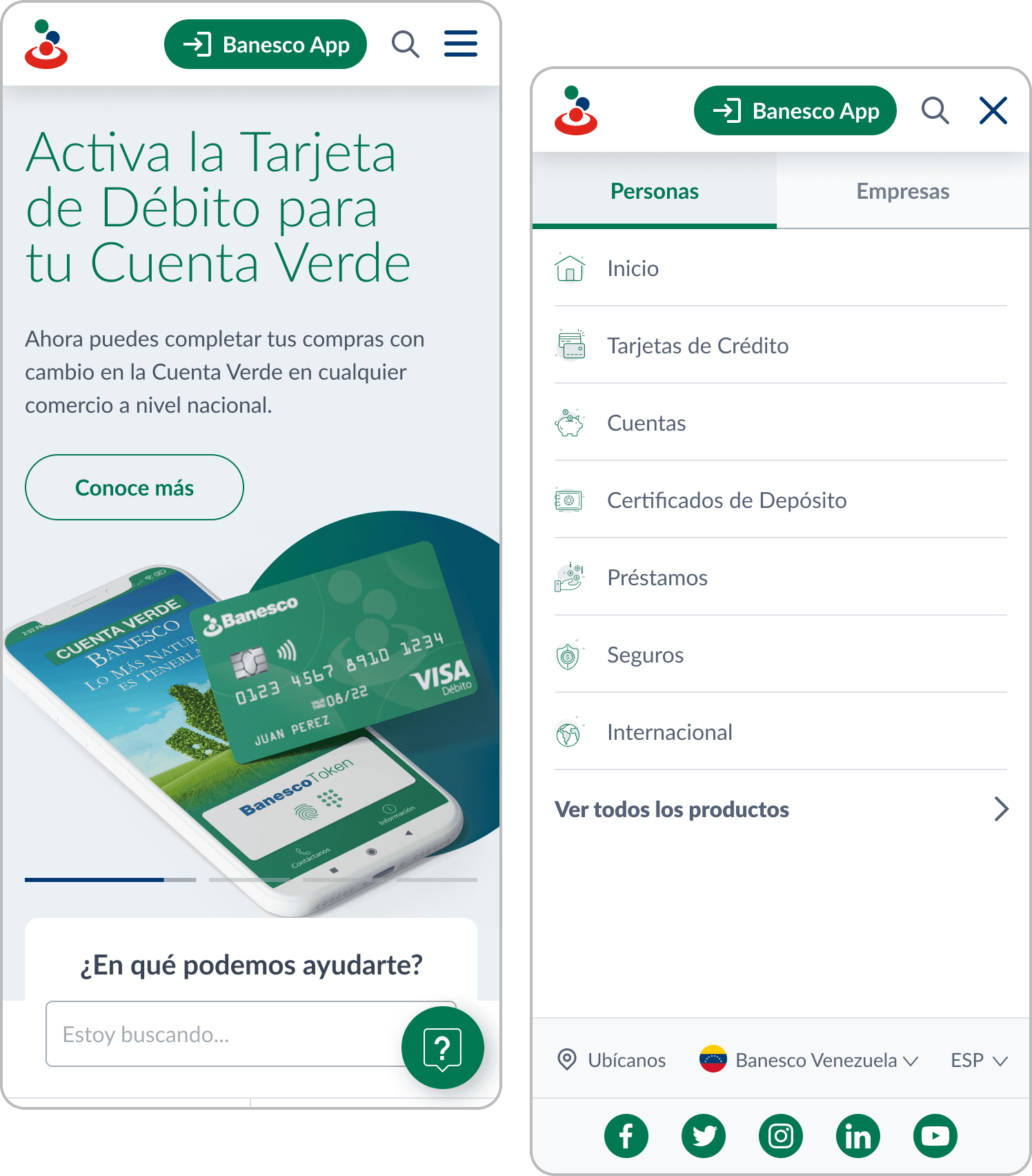
After defining the sitemap and the common sections that would be used to personalize the content of each site, we worked on the wireframes in their mobile and desktop versions, exploring and presenting different menu, headers, and banners proposals. Then we moved on to the high-fidelity mockups, starting to work on the design system with the text styles, icon system, color palette, and the different components.
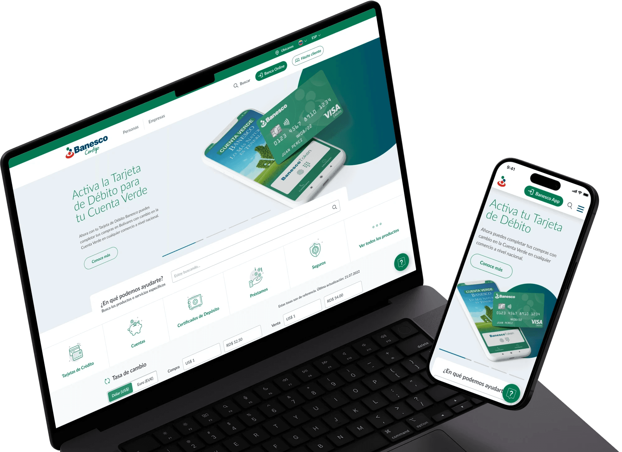
Solution & results
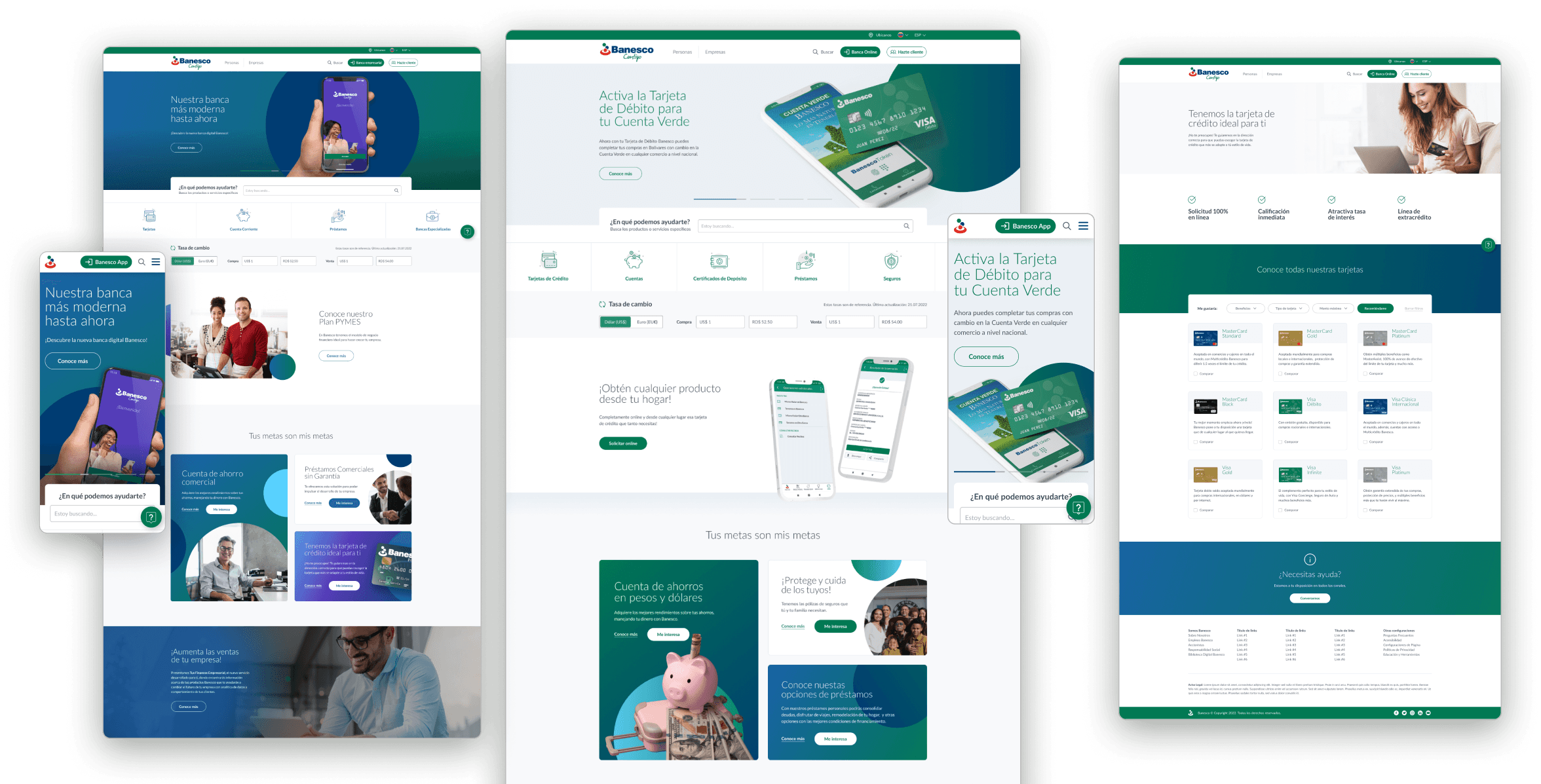
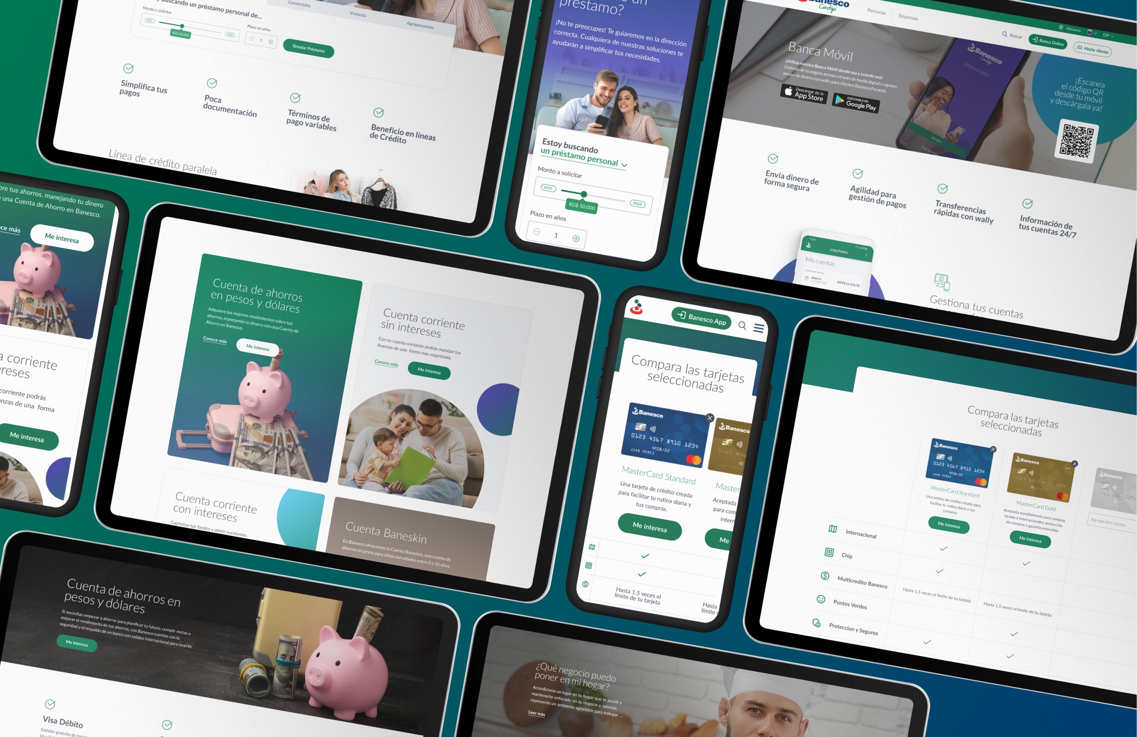
Templates were designed for each type of page (homepage, category, product, help, etc.), with replicable modules and components so that the content can be customized according to each location, with reorderable and interchangeable sections. For this, it was essential to develop a design system that serves as a guide for the locations to follow the guidelines when using the different sections and adding their own content, according to the needs of each site.
In this way, different versions of banners, grids of cards for different products and services, sections of advantages and benefits, accordion systems with collapsible information, among many other components, were created.
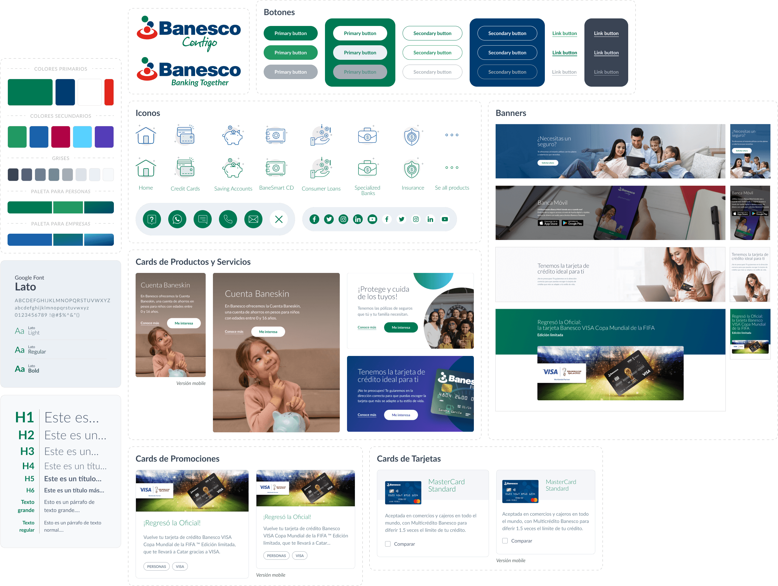
From the new design system established, everything was handed over to the development team to work on building the editable blocks for WordPress, whose builder was used to create the pages that each headquarters needed, adding or removing sections and customizing the content of each block. At the same time, a style guide was provided to all headquarters to follow the guidelines when creating each page and thus maintain consistency.
As a result, we obtained a customizable WordPress template, based on the design system developed and integrated with the builder blocks, adaptable to the content that each headquarters needed to implement.
What did we find on other banks' websites?
What did we find on other banks' websites?
Traditional banks have a complex system of menus and submenus, requiring quick access to main pages.
Clear and quick identification of help and customer service sections.
Clear and friendly language for the user.
60%
Conversiones más altas
90%
A single style guide for all locations
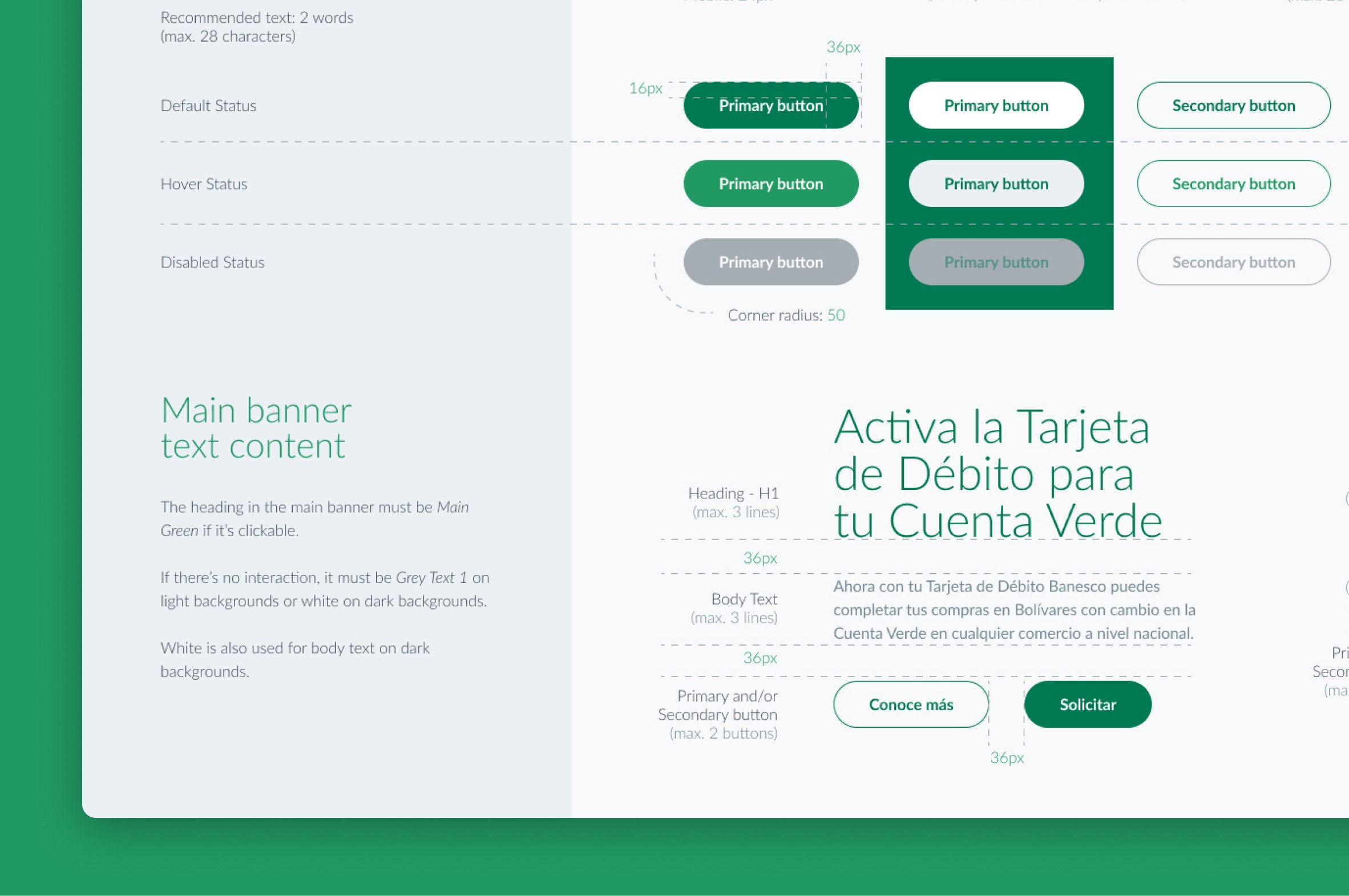
A style guide was created with guidelines and instructions for the correct use of logos, colors, typography, and components with their different states, detailing sizes and spacing, padding and margins.
