Redesign made for V-Tell, a mobile phone operator that offers a single SIM card, which allows you to use a large amount of telephone numbers from different countries, anywhere in the world.
Project overview
V-Tell is a Russian mobile network operator that offers its services globally. Its distinctive feature is its unique SIM card that allows you to use a large amount of numbers from different countries, so you always have a local phone number anywhere in the world.
We redesigned the customer dashboard to provide a more intuitive and visually appealing interface for managing their accounts. The new design aligns with the company's refreshed branding and offers streamlined access to features such as bill payment, number management, and service upgrades.
Our goals

Problem
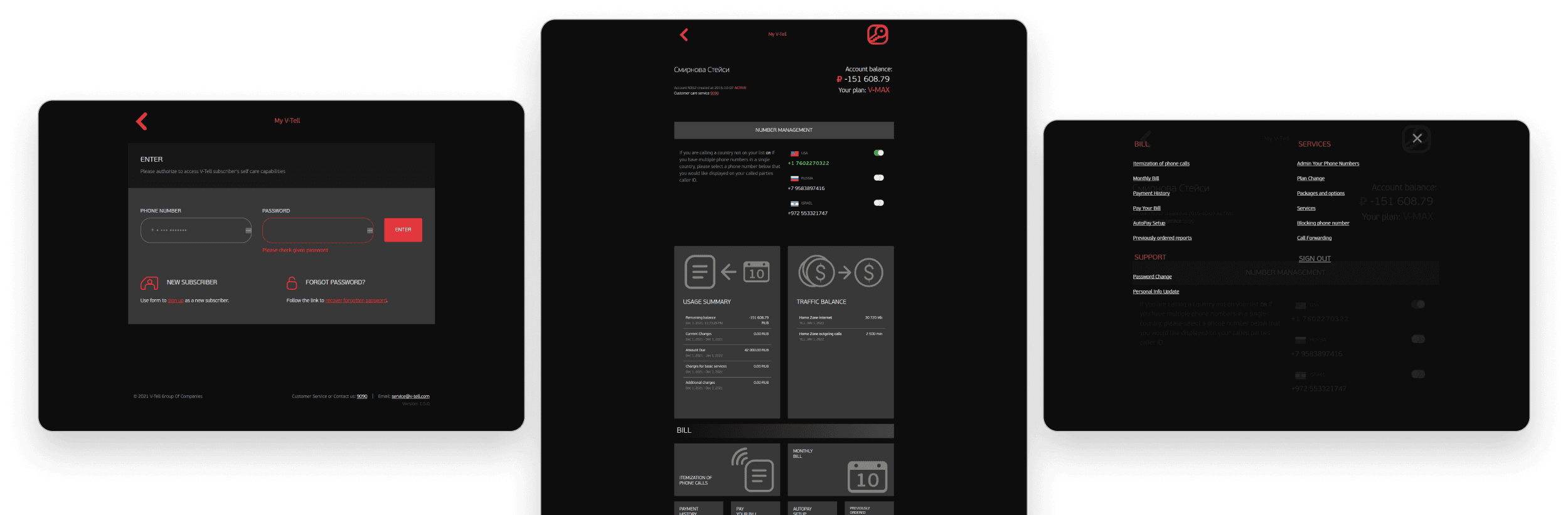
One of the main issues with the interface was the difficulty in viewing, differentiating, and accessing the different options. They were hidden in a menu with an unconventional icon and a card system that generated a very long vertical scroll, impacting usability and efficiency.
The structure did not follow the format of a conventional dashboard nor commonly used design patterns for this type of interface, making it difficult for the user to understand their location. Additionally, the overall design appeared outdated and did not align with the company's branding guidelines, affecting consistency and reducing the site's trustworthiness and transparency.

Low levels of usability and efficiency

Lacks a clear, conventional and organized structure

Options are poorly organized and difficult to find
Previous version of the dashboard, with a card system on a vertical scroll.
Design process
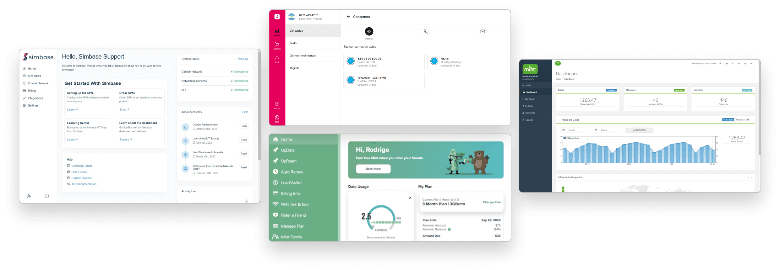
We began by conducting a competitive analysis of dashboards in general and those of other telecommunications companies, seeking common structures and patterns to identify improvement opportunities. Additionally, we performed a heuristic analysis of the client's previous dashboard to address specific issues and enhance usability.
Seeking common structures and patterns
Our analysis of competitor dashboards revealed several recurring design patterns:
Horizontal layout with a clear separation between the menu and the main content area.
Fixed sidebar navigation system with both primary and secondary menus.
Modular content modules positioned on the right.
Consistent use of icons to visually represent each menu item.
Finding problemas and improvement opportunities
The dashboard did not adhere to the industry-standard design patterns and structures commonly found among competitors.
The arbitrary use of the icon (key) to represent the menu deviates from established design conventions.
The oversized card system wastes valuable screen space, impacting usability and efficiency. As a result, users are required to scroll excessively to view all available options.
The information presented lacks a clear hierarchical structure, making it difficult for users to discern the relative importance of different elements.
Following our analysis, we focused on restructuring the dashboard layout and developed initial visual designs for the login, homepage, and add funds screens. Given the existence of a pre-defined design system with a rich library of icons, colors, and reusable components, we opted to skip the wireframing phase and proceed directly to creating mockups.
Other mobile operator dashboards.
Solution & results
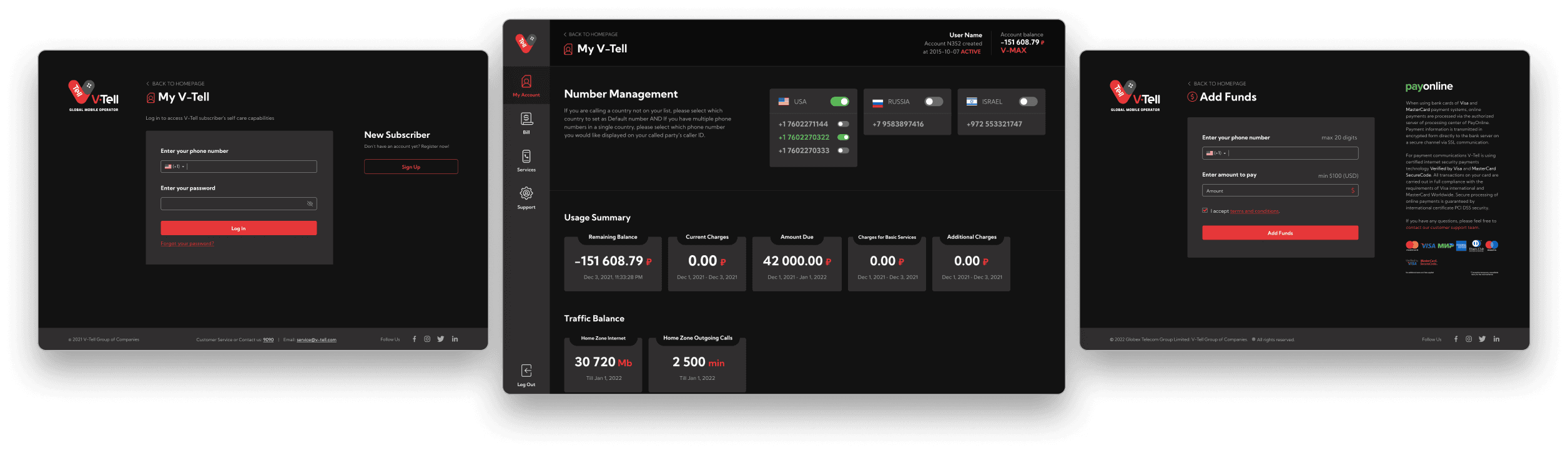
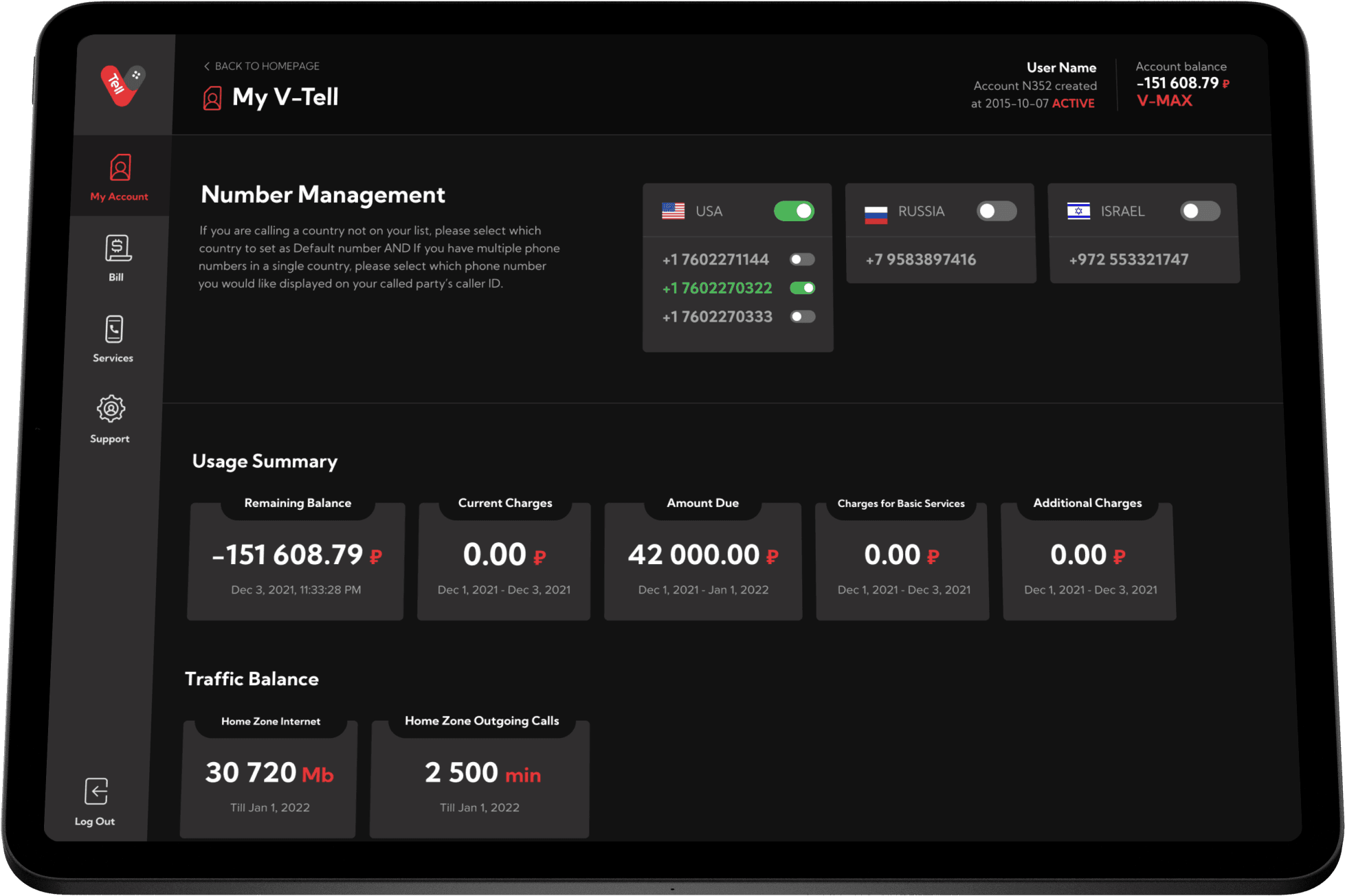
Based on our analysis of industry best practices, we redesigned the dashboard with a horizontal layout. This new structure, divided into four primary categories - My Account, Bill, Services, and Support - provides a clear and intuitive navigation experience:
My Account: dashboard's home page, with a summary of the user's information and phone numbers.
Bill: information about bills, reports, and the function to pay or add funds.
Services: manage phone numbers, add or remove services, or change the plan.
Support: options to update personal information and change the account password.
Each of these categories, except for My Account, features a dropdown menu that reveals additional options upon selection.
The idea was to to display all relevant content on a single screen, minimizing the need for scrolling. The sidebar navigation and top header remain fixed in position, ensuring that users can easily access all features and information at a glance.

New horizontal layout following industry standards and conventions
Fixed sidebar menu and submenus system for quick page switching
Information hierarchy with cards, accordions, and divisions for better readability