TuBondi is an app to check the schedules and routes of La Plata buses and activate reminders to arrive at the bus stop on time.
Project summary
This project was developed as part of the UX/UI Design course offered by Coderhouse between March and June 2024. The goal was to design a native mobile app from start to finish, culminating in a high-fidelity prototype.
I decided to create TuBondi, an app designed to provide real-time schedules and routes for all buses in La Plata. Users can set reminders to ensure they arrive at their bus stop on time.
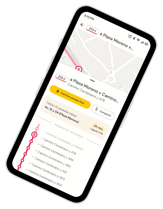
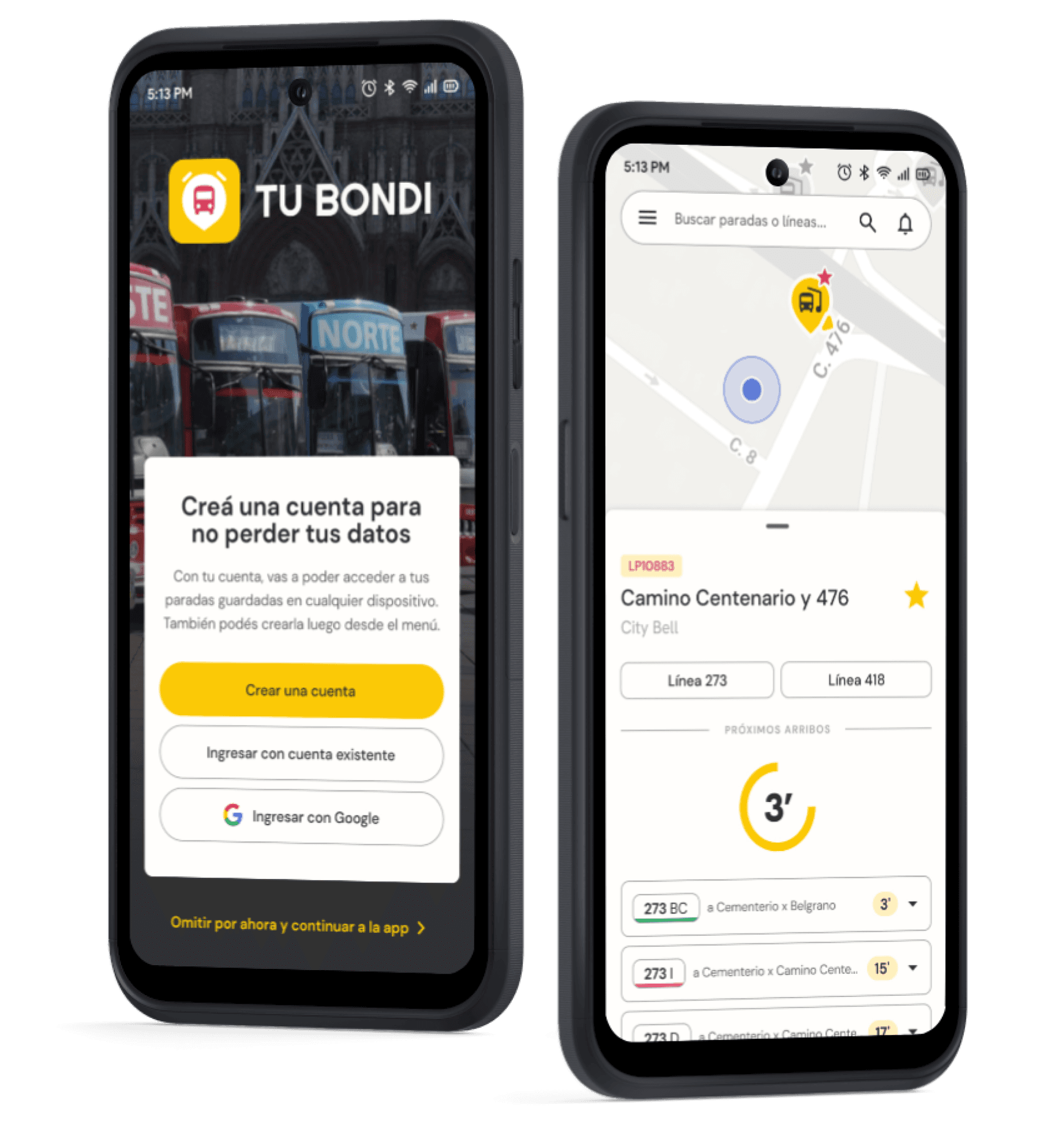
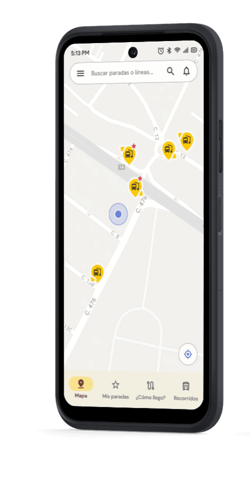
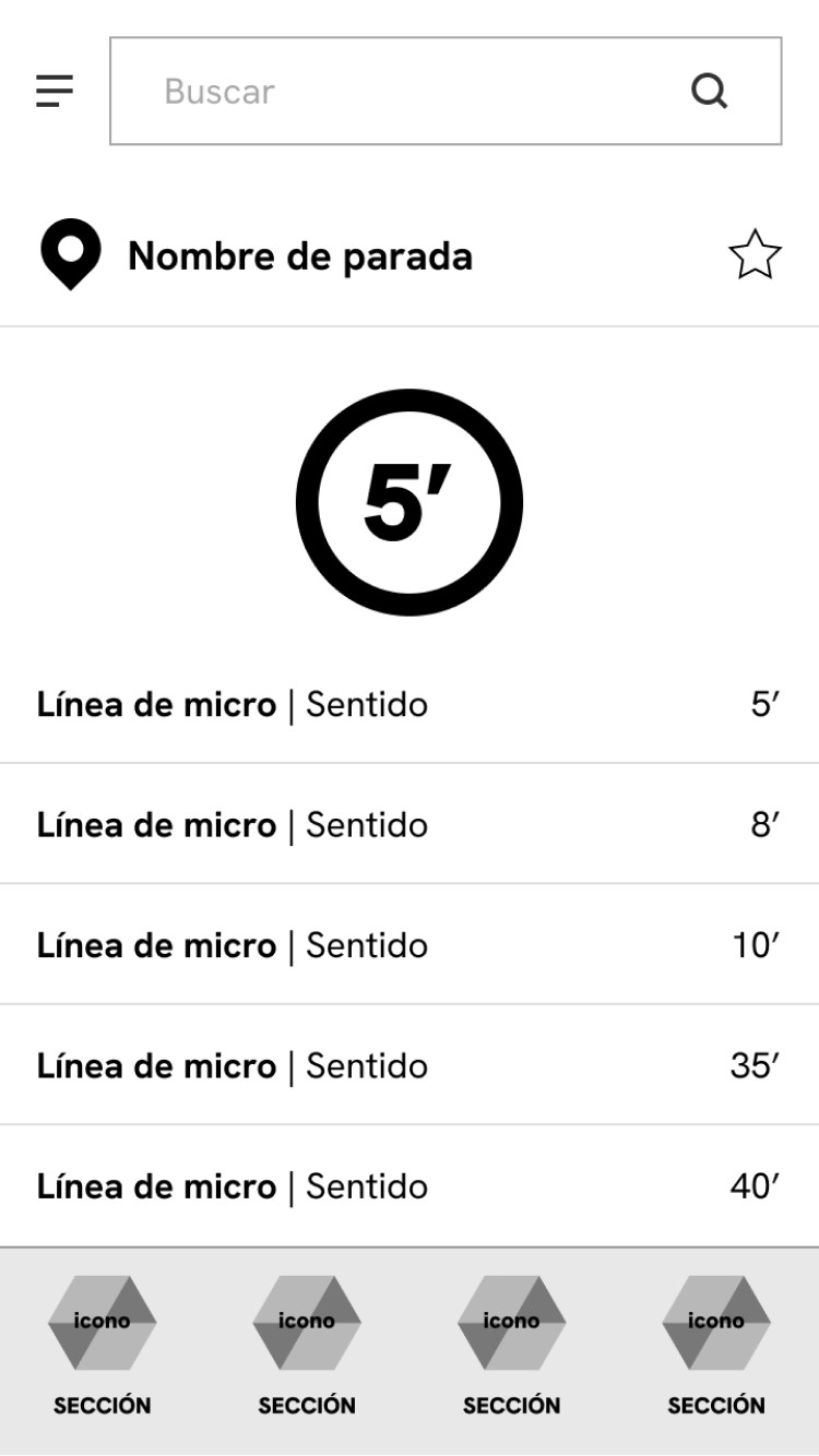
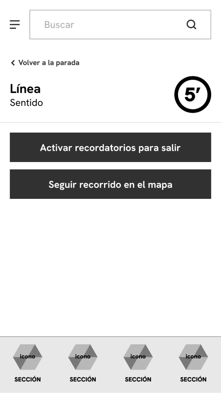
By selecting a nearby bus stop, users can view upcoming arrival times and set reminders for specific buses. For those unfamiliar with the city, the app also includes a map feature that allows users to track the bus route and select their final destination.
Problem
How many times have we all had to wait 30 minutes at the bus stop because no bus came or saw one pass right in front of us just as we were about to arrive?
Although there are several apps to check public transportation schedules, many times they are not accurate or we get distracted and don't make it to the stop on time.
In the city of La Plata, there is a mobile app developed by Unión Platense, the company that manages all the local bus lines, which is very accurate with schedules but is not very intuitive, difficult to use and confusing in some cases. It has no other functionalities than showing schedules and routes, however it is the most used by the people of La Plata.
We decided to take this app as a starting point to propose our hypotheses and look for opportunities for improvement. The idea was for it to be a municipal service so that it is something local and limited, and not to overwhelm the user with information.

What is the initial problem?
When taking a bus, people do not want to waste time at the bus stop because they left home late or waiting for the right bus to come along because they do not know the schedule. Also, when going to unknown places, they do not know which line is best for them, what its route is or where the nearest stop is.

Whad do we want to achieve?
Provide accurate information quickly and easily on schedules, stops and routes.
Avoid wasting time and reduce stress/anxiety among users.
Be a complement to a more efficient public transport system.

How can we solve it?
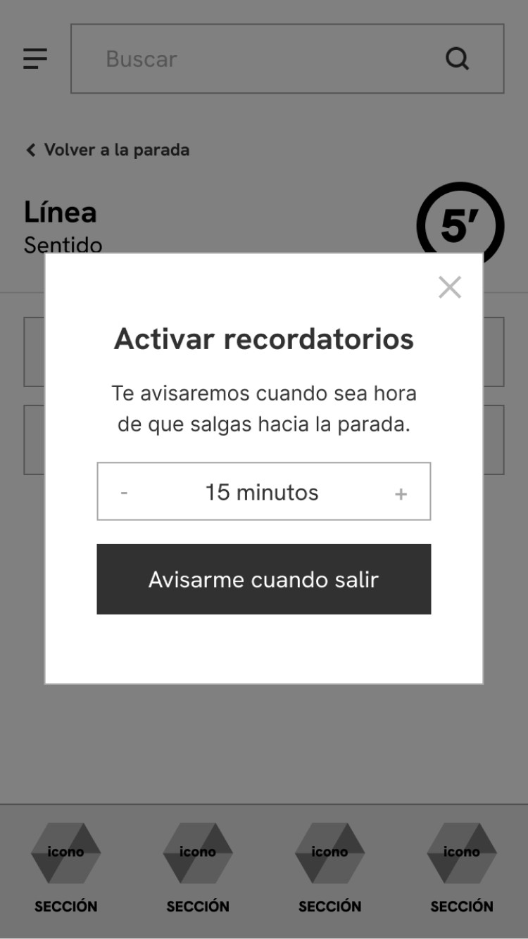
An app that allows users to see nearby stops, find out the schedules of the next buses, and activate reminders to go to the stop; as well as being able to enter a destination to see the different lines that are useful to the user and the route of each one.
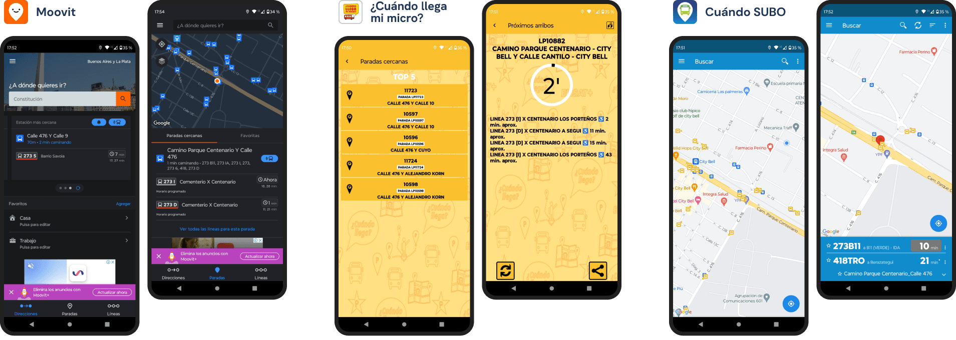
Some of the existing apps that show the schedules of different buses.
Design process
To arrive at a solution, we first have to know our users to validate the initial hypotheses or propose new ones, and analyze the competition to discover what works, what fails, and everything that can be improved.
That's why we conducted a benchmarking study to analyze 3 competing apps that fulfilled at least the main function of displaying public transport schedules:
Moovit: app with optional subscription, that includes global information about maps, schedules and bus directions.
¿Cuándo pasa mi micro?: platform to access La Plata bus schedules in real time.
Cuándo SUBO: app to find out the time of the next bus arrival, with data from 200 lines in Buenos Aires.
We can conclude that the new solution should be intuitive and easy to use when searching for a stop, accurate with the schedules, and with no irrelevant content that could confuse or overwhelm the user.

Moovit

¿Cuándo llega mi micro?

Cuándo SUBO
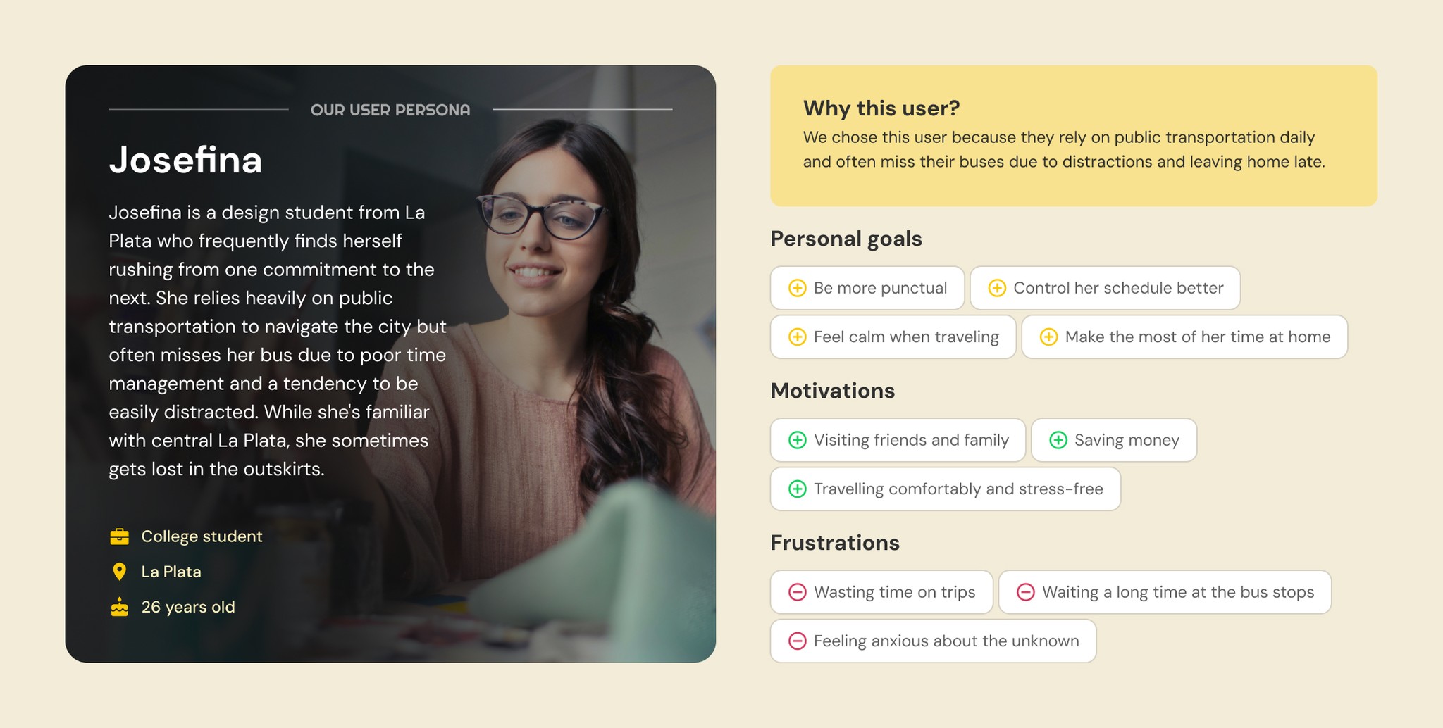
Following this, we conducted interviews with 4 people living in La Plata who frequently used public transportation and one of the aforementioned apps to get around the city. Based on the collected data, we created empathy maps and validated our initial hypotheses, consolidating all the information into our user persona.
One of the most repeated issues in the interviews was the problem of arriving late at the bus stop and missing the bus due to being distracted at home, despite knowing the schedule of the next arrival in advance using one of the apps.
We found as an insight the poor calculation of personal time and the desire to be more punctual.
With all this new information from user interviews and competitive analysis, we can define the POV (Point of View) of our user with three key points: who, what, and why. At the same time, we've conceptualized the first instance of a possible solution by defining the MVP: the Minimum Viable Product that includes the basic and essential features or functions to satisfy the primary need.
POV
MVP
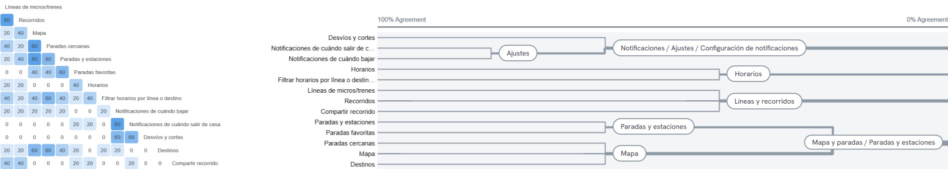
After defining the problem and potential solution, we moved on to working on the content with information architecture. To do this, we conducted a card sorting exercise based on an initial sitemap. The results of this exercise helped us understand how users would organize this content and allowed us to make the necessary modifications.
Similarity matrix and dendrogram with the results of user categorizations.
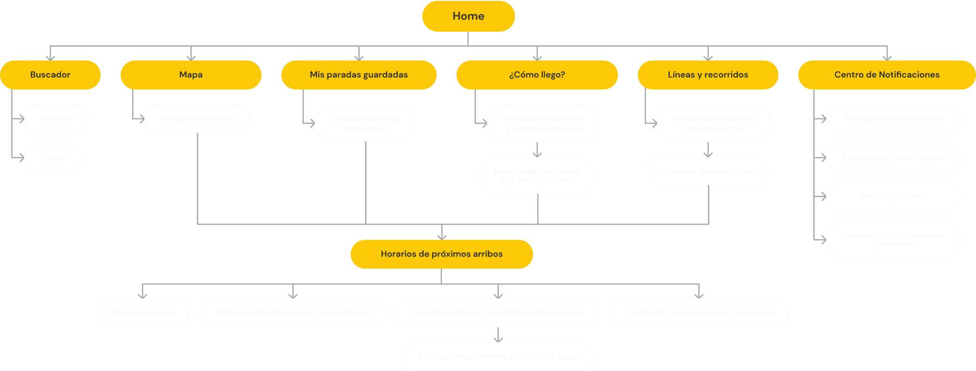
Final sitemap, modified after card sorting results.
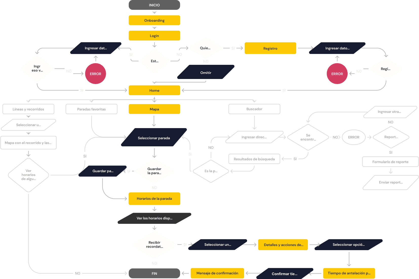
We can now start thinking about the different interactions and branches that can occur in this sitemap when the user navigates the MVP. To do this, we developed a user flow that outlines the various processes, actions, and decisions that the user can make when performing the main task from start to finish.
View schedules and activate reminders
User enters the app for the first time to search for a stop on the map, see the schedules of the bus he frequently uses, and activate reminders to leave home.
User flow
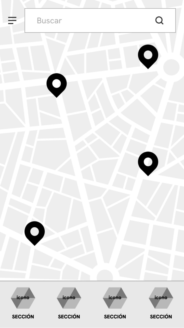
With the MVP user flow defined, we started to visualize the user interface by seeking inspiration from various apps. Beginning with initial paper sketches of the home screen and other key screens, we developed low and mid fidelity wireframes to define the visual structure of each screen.
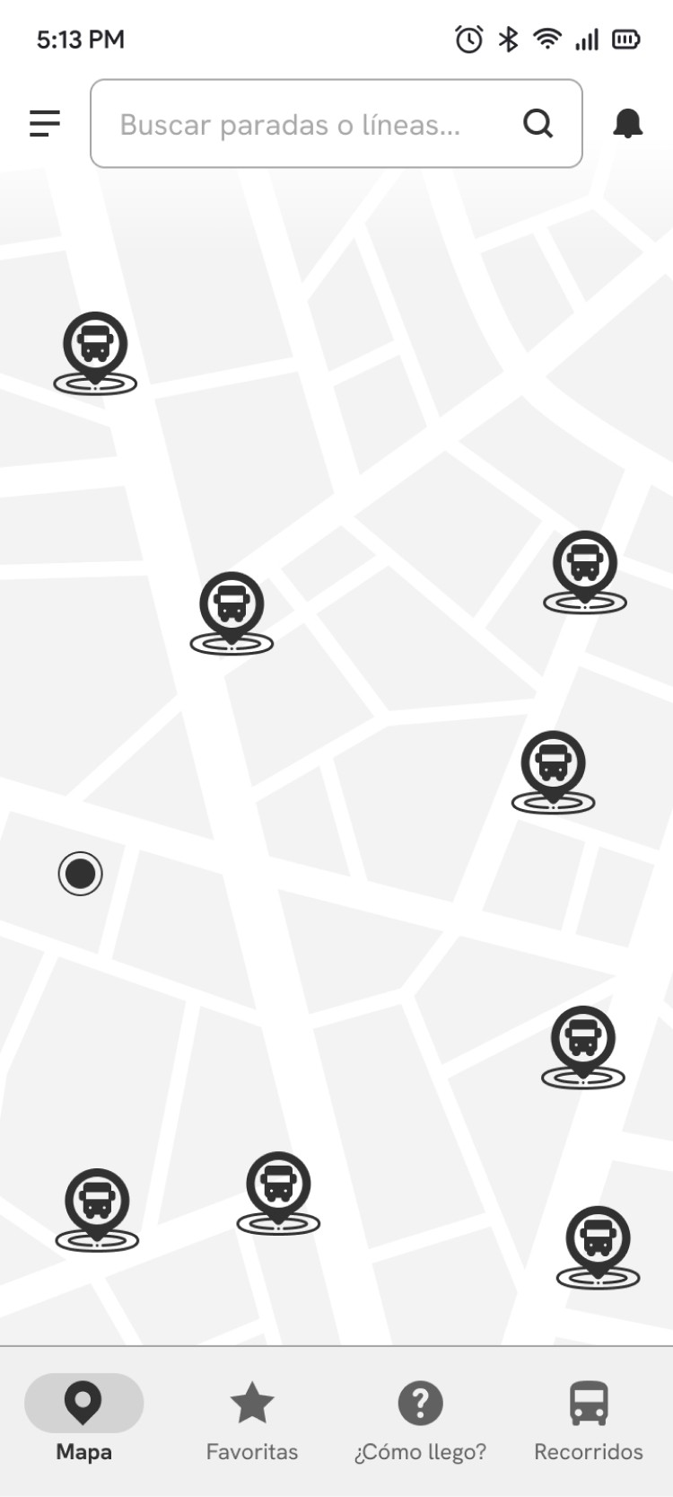
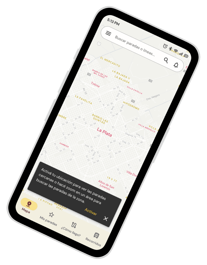
The core idea was to use a map centered on the user's location with nearby stops as the home screen, complemented by a bottom navigation bar for accessing the main functions and a top menu with a search bar and additional options hidden in a hamburger menu.
Low-fidelity wireframes, based on the main task of the MVP (select a stop on the map, view the schedules and activate the reminder).
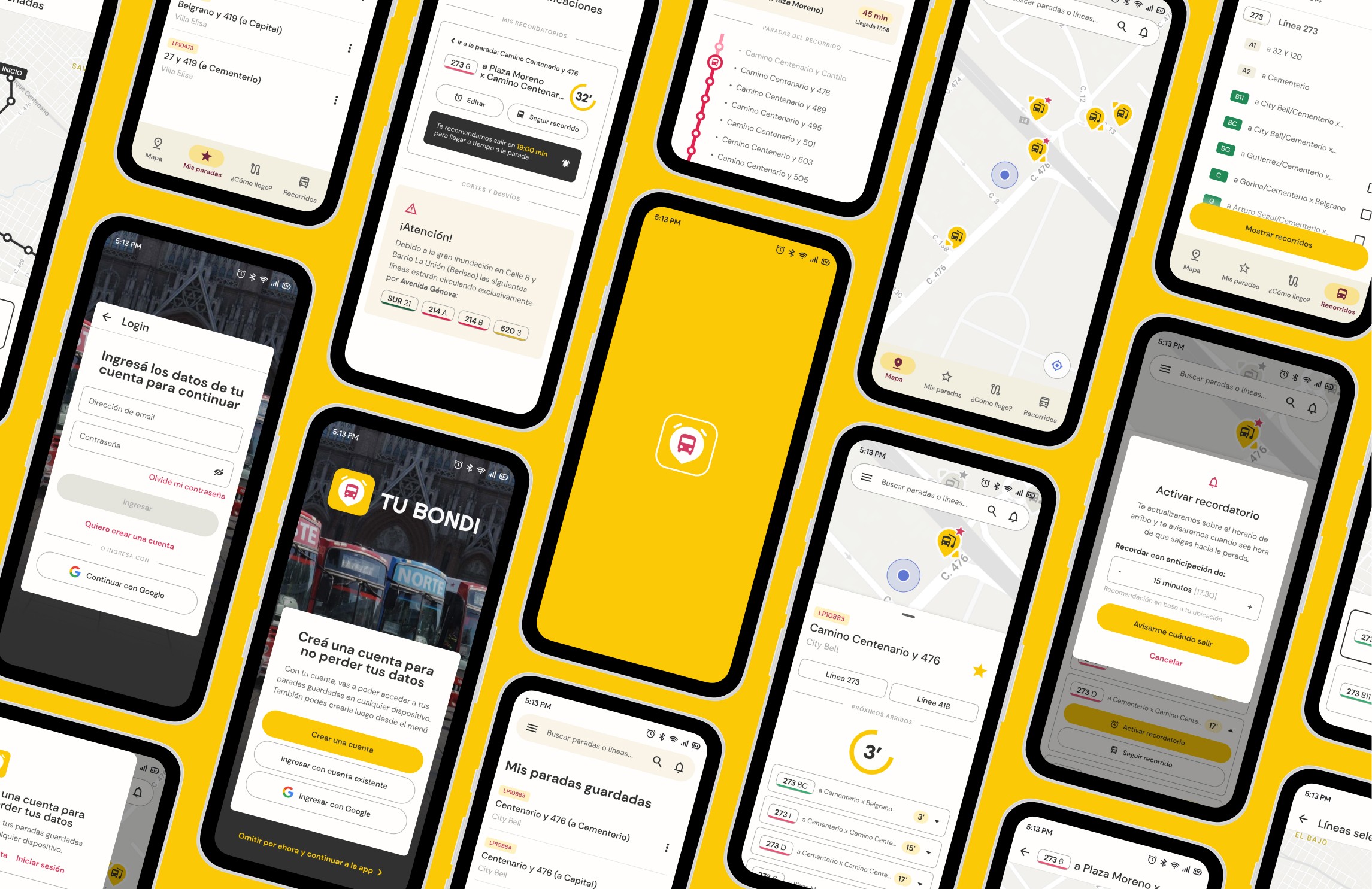
Following the initial low-fidelity wireframes, we adopted Atomic Design principles and adhered to Android's Material Design 3 guidelines to begin creating components and increasing wireframe fidelity. This involved incorporating design patterns and developing additional secondary screens, such as a favorite stops page and a notification center.
Mid-fidelity wireframes, defining some design patterns based on Material Design and adjusting details.
Solution and results
Once the main page structures were defined with wireframes, we added interactions and animations to create a functional prototype for user testing, ensuring that it adhered to usability heuristics.
Usability tests were conducted with 5 users to identify what worked and what didn't, providing insights for improvement. After the tests, a satisfaction survey was sent to users to rate their experience with the prototype. Subsequently, we reviewed the recordings to complete log sheets and evaluate efficiency and effectiveness metrics.

Evaluated tasks
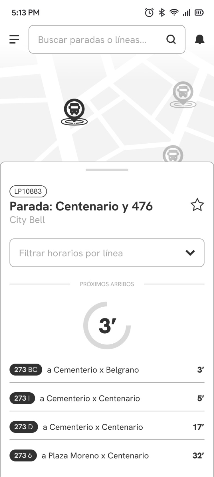
Find the schedule for the next bus (line 273, branch 6) that stops closest to your home and set a reminder to leave on time.
Compare the routes of lines 273 BC and B11 and determine the final stop for line 273 BC.
What worked
Users found searching for bus routes to be seamless.
60% of users successfully activated reminders based on the arrival time of their next bus.
80% of users were able to accurately identify and select their nearest bus stop on the map.
What didn't work
Onboarding screens were skipped quickly.
Users spent a significant amount of time on the login screen, suggesting they needed more time to process the information.
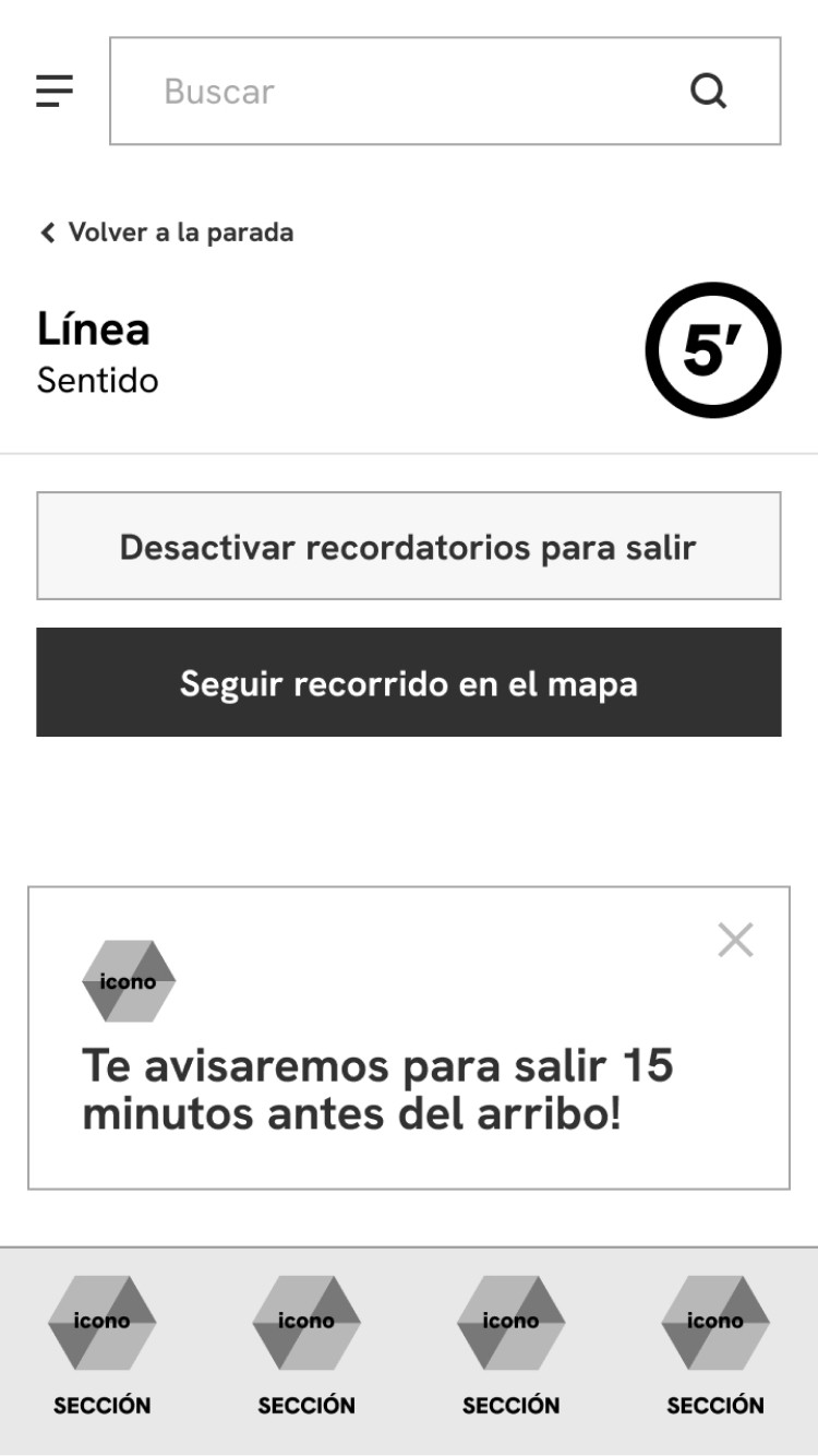
The snackbar notification confirming the reminder was largely ignored.
2 out of 5 users struggled to find a stop, initially navigating to the Routes [Recorridos] section.

Points to improve
Consider removing the login screen altogether to streamline the onboarding process, as registration is optional.
Allow users to explore the app without immediate registration, offering a signup option within a menu.
Simplify onboarding with shorter texts and complementary images.
Add location permission pop-up at the beginning, highlight specific advantages for the user, such as finding nearby locations.
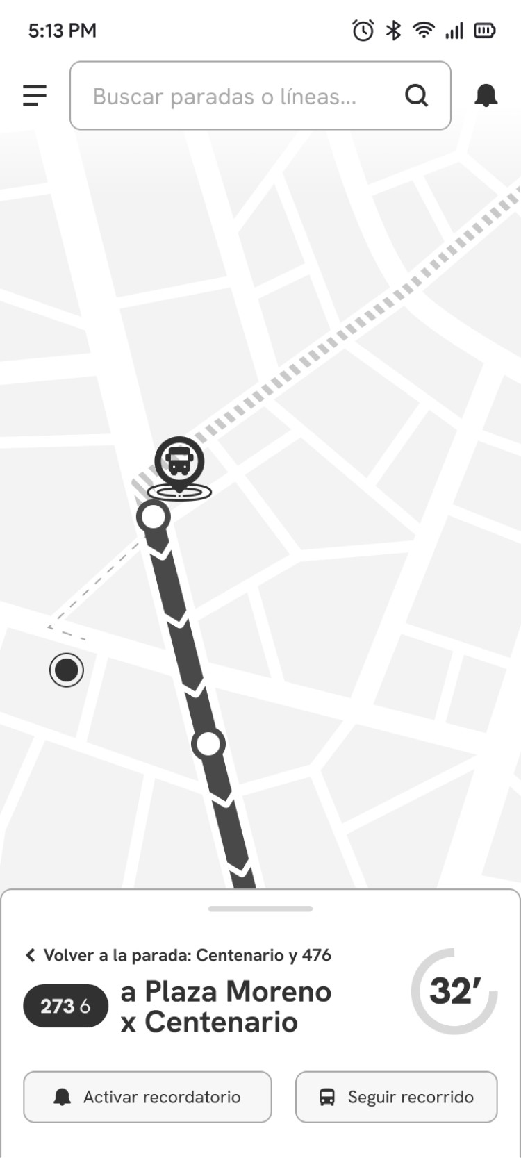
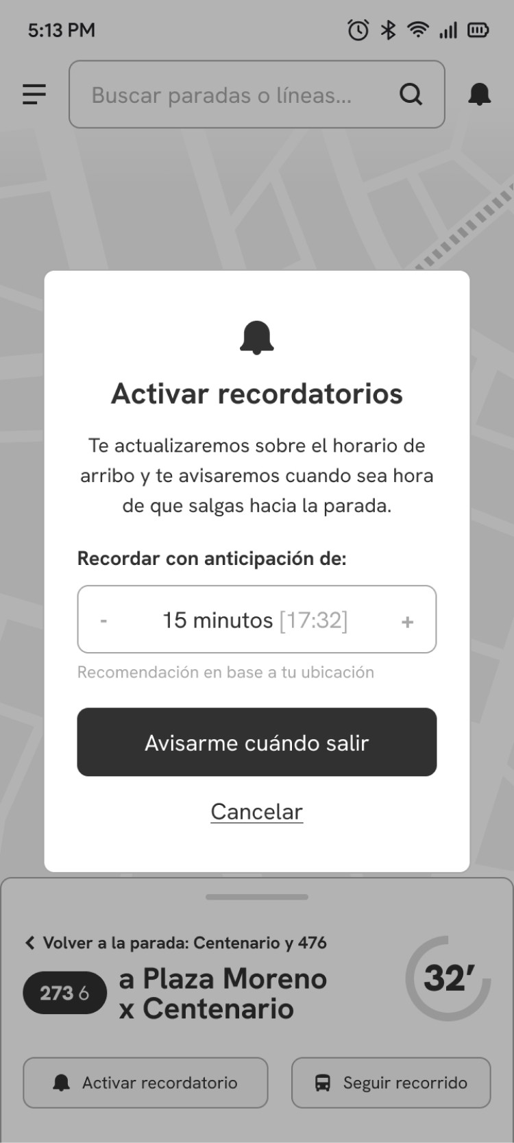
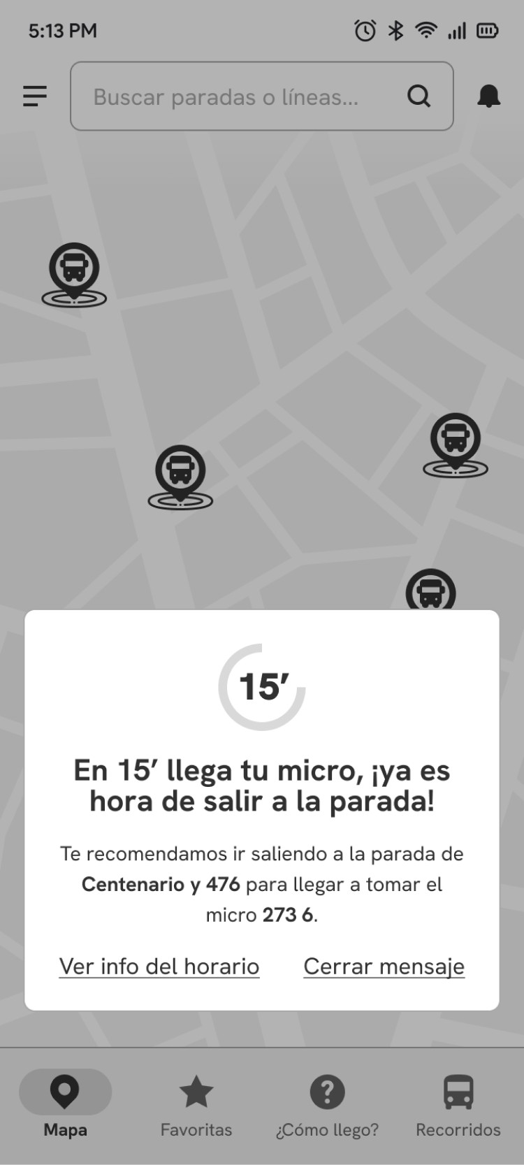
Improve visual feedback after activating a reminder.
Following our usability tests, we returned to the prototype to further refine it, focusing on both visual fidelity and functionality. Starting with a mood board, we consolidated our UI kit, defining typography, colors, animations, and additional components.
We drew inspiration from the branding of La Plata Municipality and Unión Platense, as well as the shared color palette of all local bus lines, which allows for easy identification. Regarding the interface and tone of voice, we looked to Uber and similar transportation apps for guidance, adopting their friendly language, minimalist maps, and clear information presentation.
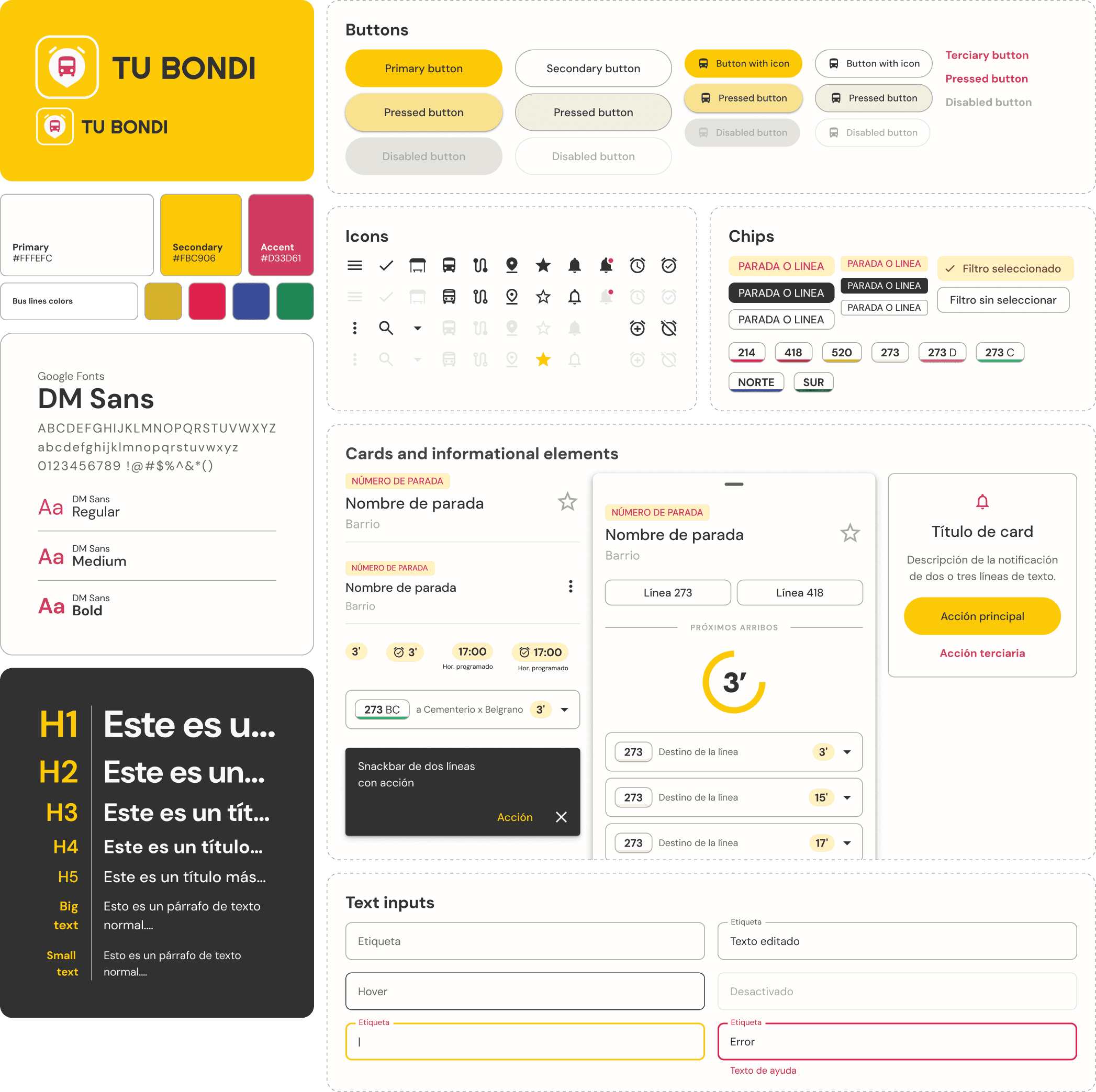
Once the UI kit and components were implemented, we introduced new adjustments to enhance the user experience and usability, iterating and validating our decisions. Here are some of the modifications and improvements made based on usability testing results and heuristic review:
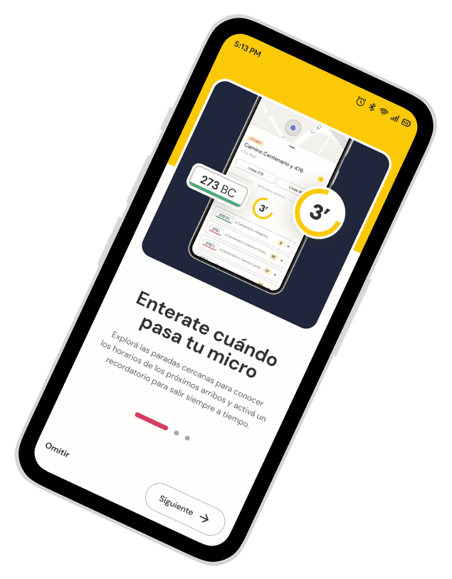
Onboarding simplification
The onboarding process was streamlined by condensing the text on each screen to improve scannability.
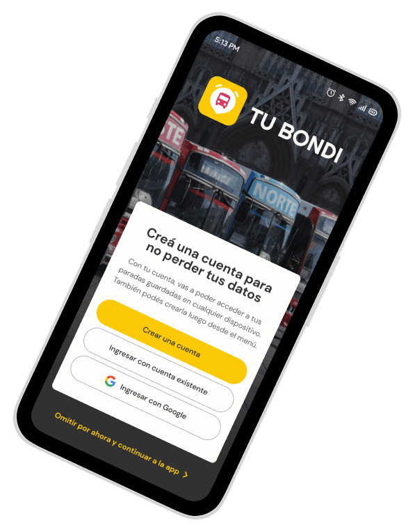
New Login/Register screen
We introduced a new, optional screen to provide users with the flexibility to either log in or create an account.
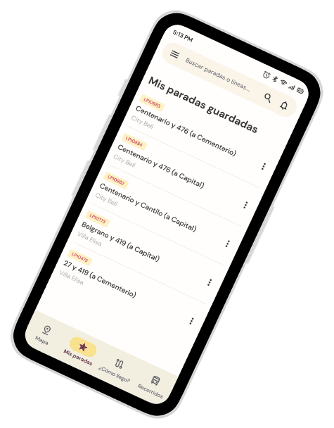
Saved Stops Optimization
We changed the name to be more intuitive and descriptive, both in the menu and title. Additionally, we moved actions to a three-dot menu to prevent accidental deletion of stops.
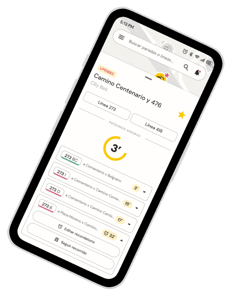
Clickable schedules and visual feedback
We've redesigned the schedule format using dropdown boxes to make them more clickable and consolidated all actions in one place.
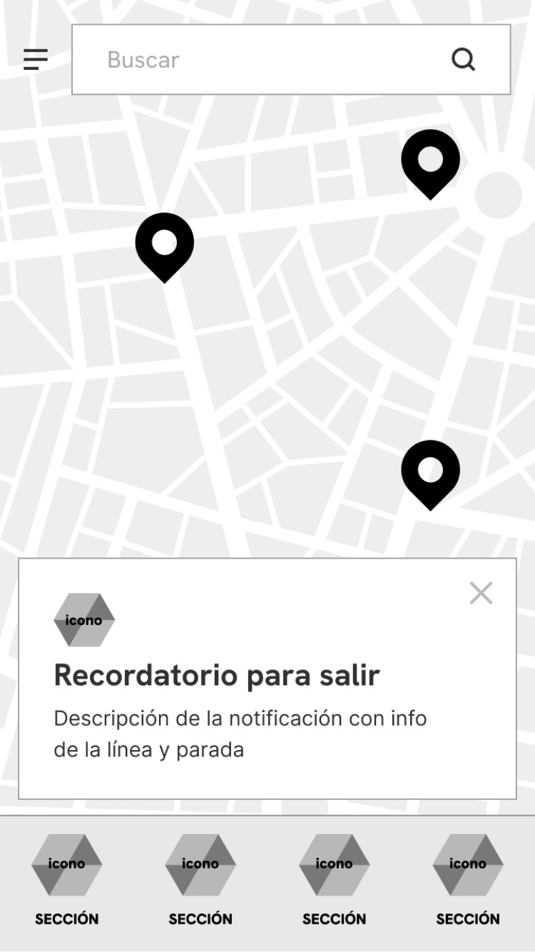
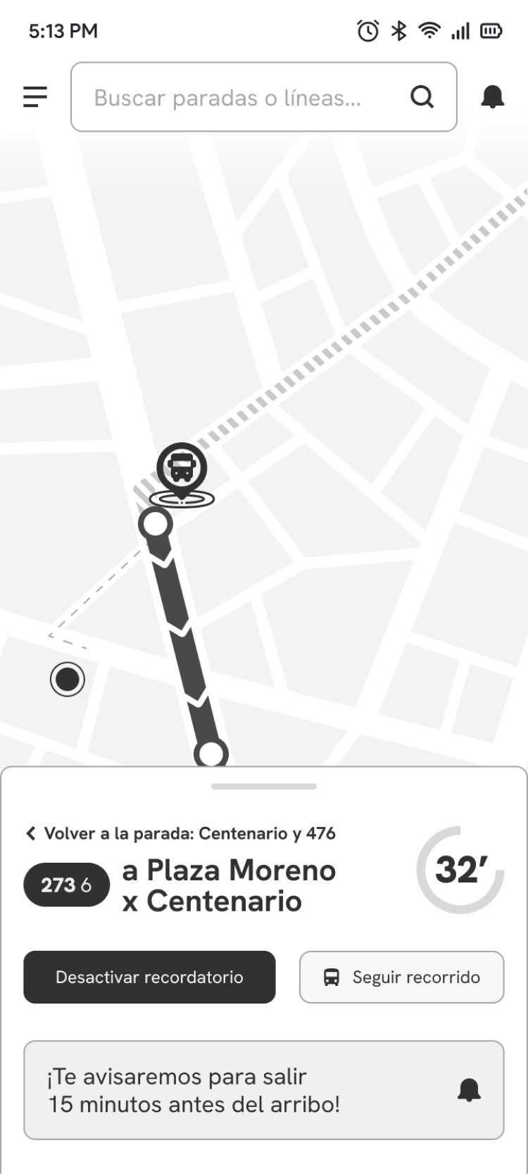
We've also added visual feedback elements like an alarm icon for reminders, snackbars, and an animated notification center icon.
Location permission
We added a location permission screen and a suggestion to enable it to show the differences.
Follow route
We added screens for the Follow route feature and the action to select a final stop.